Škoda Logo
 Škoda Logo PNG
The automaker Skoda is one of the most famous brands in the world that manufactures passenger cars, as well as mid-range crossovers. Skoda cars, whose country of manufacture at first was only the Czech Republic, have been produced for European consumers for more than a hundred years. However, the popularity of this brand has led to the need to expand production, and its factories are already located in several countries. Skoda, a subsidiary of the Volkswagen Group, has established itself as a reputable brand that produces superior and practical vehicles.
Meaning and History
![]()
Škoda is a major car manufacturer from Czech Republic, selling over 1 million vehicles annually. The company originates from Laurin & Klement brand that started building cars in 1895. Later on it was acquired by Škoda Works, a large Bohemian industrial conglomerate, founded in 1859, and went on manufacturing vehicles under the Škoda name. The company became the leading Czechoslovak car manufacturer by 1939, but was forced to serve the German military needs during World War II occupation. The company revived after the war and went on to design several successful models, mainly rear-engined.
However, the company failed to build solid reputation in North American market and concentrated on Europe. In 1991 Volkswagen bought a big stake of Škoda and invested in the brand’s development with an idea to turn it into their entry-level manufacturer. However, Škoda later began to build bigger and better-trimmed models, based on Volkswagen range, and became highly competitive in European market.
The company’s most successful models are Octavia, Rapid, Fabia, Yeti and Superb.
1895 – 1905
![]()
The first logo was a black-outlined wheel, colored beige and with a rectangle over it. At the top of the rectangle, they placed a yellow area with the words ‘V Laurin & V Klement’. Beneath, there was a similar yellow area in which they placed ‘Mlada Boleslav’ script. On the rectangle, there was also a circle split in yellow, white, red and again yellow color zones. There, they wrote the black ‘Scavia’ inscription of a slim sans serif type with uppercase letters.
1900 – 1905
![]()
In 1900, they introduced a dark beige badge with white ornamental lines on it. In the center, they placed a white zone divided by a two ovals with what seems to be simple wings on each side from them. At the top, the red ‘Scavia’ word showed off. Below, they placed a wavy rectangular area colored red. There, they put ‘Laurin & Klement Mlada Boleslav’ inscription. It was written in circle, and had a brown sans serif type with fewer gaps between letters.
1905 – 1925
![]()
In the early years the vehicles produced by the company bore the Laurin and Klement logo on the grills. It was composed of golden L and K letters on red background, embedded into a circle, ornamented with flowers.
A 1905 round emblem was a seal rather than a logo. In the center, they drew a red area with ‘L&K’ monogram, written in a gold sans serif font with large letters. The circle was outlined gold from a black ornament with white flowers and two yellow circles at the top and bottom. The ornament itself had a double yellow and black contour. The external part of the seal was a fat yellow frame.
1913 – 1929
![]()
The next logo was a handwritten nameplate. It had a fat black script with a twisty style.
1923 – 1925
![]()
After takeover by Škoda Works, the L&K logo was dropped and a new iconic badge was designed. It featured an arrow with a wing, symbolizing aspiration for the future and moving forward. Another association was a headdress of an Indian with five feathers.
Below the arrow, they wrote the new name in a blue sans serif type with the letters decreasing in size from the first to the last so they looked going into the distance.
The logo was designed in blue and white colors, and became a memorable symbol that was destined to become a long-standing representation of the Czech manufacturer.
1925 – 1933
![]()
The 1925 logo was an oval badge. In its central part they placed a blue zone with the golden colored brand name, executed in a handwritten script. The blue zone was outlined in gold, drawn alongside a black line in the same way as it was in the 1905 logo. The badge itself had a triple contour, colored yellow, black and again yellow.
1926 – 1933
![]()
This time, the logo depicted an arrow in a circle, combination of which was used in the future years. The composition of this logo was the gradient white and blue winged arrow drawn on the gradient blue and dark blue circle. It was embedded into a bigger gradient white and dark blue circle, which, in its turn, had a blue outline, this time without any gradient.
1933 – 1986
![]()
Another logo depicted the familiar arrow colored blue inside a fat blue frame. The shades of this logo were much fatter than in the previous one.
1986 – 2011
![]()
It was only in 1986 that the emblem changed its main color to green and acquired a black circle around it, bearing the ŠKODA Auto inscription on it.
The inscription had a fat sans serif type, colored white and having large letters and bigger gaps between them. The circle itself had got a white outline.
1993 – 1999
![]()
1999 – 2011
![]()
In 1999 the 3D effect was added to the logo, and white color was replaced with silver.
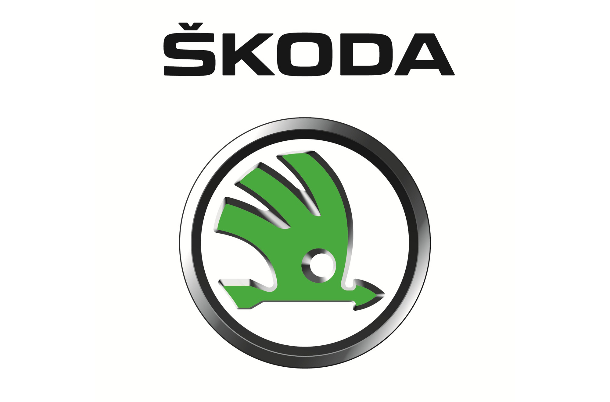
2011 – today
![]()
The latest update was made in 2011, depriving the emblem of a black circle with the company’s name, replacing it with an elegant silver ring. The logo also changed its color from deep green to light green. The emblem placed on latest cars featured black background, adding trustworthiness to the brand image.
Also, due to the gradient bright and dark shades of silver contours of the arrow and logo itself, there is a 3D effect.
2022 – now
 The Skoda logo redesign, held in 2022, has redrawn an iconic emblem in a flat plain style, and placed it above a heavy enlarged logotype in the uppercase of a futuristic sans-serif font with softened angles and straight cuts of the lines. Both elements of the badge are set in a unique light-turquoise shade, close to lime-green, which evokes a sense of progressiveness and style.
Description
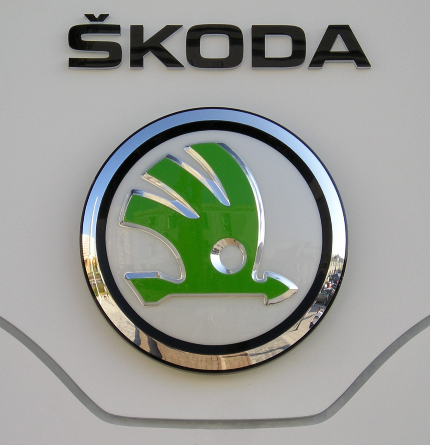
The present Škoda emblem, introduced in 2011, represents a good old winged arrow, designed in green color. This iconic symbol is placed on white background and is embedded into black and silver 3D circle. Apart from color and some trimming elements, the logo has not changed since 1926, being a widely recognizable car symbols in Europe.
Shape

The main element, composing the Škoda emblem, is embedded into the circle. It represents a stylized arrow, facing the right direction. The arrow is completed with a wide wing making a daring waft upwards. Some people note the logo’s resemblance to an Indian’s headdress with several feathers. Anyway, the symbol’s shape represents an ambitious moving forward and constant development of the manufacturer.
Color

The emblem of Škoda is widely associated with green color as it is the main tone of the emblem’s central figure. However, it was only introduced in 1990 to represent the company’s new start in automotive world, fresh approach to car manufacturing as well as environmental concern. Although green remains the brand’s corporate color, the emblems installed on Škoda cars are designed on black background to add more elegance and style.
Emblem

![]()
![]()
Official Skoda website: www.skoda-auto.com


-
 Taiwan car brands
-
 Romanian car brands
-
 Czech car brands
-
 Spanish car brands
-
 Dutch car brands
-
 Indian Car Brands
-
 Canadian Car Brands
-
 Russian Car Brands
-
 Swedish Car Brands
-
 Italian Car Brands
-
 American Car Brands
-
 Japanese Car Brands
-
 European Car Brands
-
 Chinese Car Brands
-
 Korean Car Brands
-
 Australian Car Brands
-
 British Car Brands
-
 French Car Brands
-
 German Car Brands