Renault Logo
![]() Renault Logo PNG
Renault Logo PNG
Renault is a well-known and one of the most popular car brands, selling about 3 million vehicles worldwide every year. Despite the fact that Renault was not the first car manufacturer in France, it quickly became the country’s largest carmaker. Renault cars are produced by the French-Japanese company Renault-Nissan, which occupies one of the leading positions in the automotive industry. The popularity of this brand is due to the high quality of the vehicles produced, as well as their technological characteristics. Renault cars are one of the safest and most functional cars.
Meaning and History
![]()
Renault enters the top list of major automakers all over the globe. At the same time this brand is the major car producing company in France with a very rich history. It is specialized in manufacturing wide range of auto models, trucks, buses, tractors and other vehicles for different purposes. After it established collaboration with Nissan it turned on to one of the biggest auto producers in the world making it possible to compete with other giants of automotive industry. At the moment it has over 128 400 employees with €72.93 annual assets.
Not surprising that Renault badge is among the most recognizable logos.
1899 – 1906
![]()
The brand was founded in 1899 by Renault brothers. This is when newly established company got its first official logo. At that time brand was called Société Renault Frères. The badge was rather simple containing the initials of every brother. However it underwent numerous changes and modifications throughout the history of the company.
1906 – 1919
![]()
First redesign was made in 1906. It was a black car drawn in front. It stood inside a circular frame styled as a gear. The gear itself was encased in a thin circular line. The whole logo had black a white shades.
1919 – 1923
![]()
For some time, they used a watermark with Renault FT tank put in a circle. The shades were fat black and white.
1923 – 1925
![]()
The next logo was a circle with a black border. Much of the inner area was white, save for 20 black horizontal stripes of various lengths. They were limited by a white frame near the edges. The word ‘Renault’ was placed in the middle within a black rectangular space.
1925 – 1946
![]()
However the firs diamond shape which is known all over the world appeared only in 1925. Only slight modifications have been made since that time during 1946 and 1959. But the base of the logo was still the same till present days.
This time it was a rhomb inside which they drew 16 black lines of various shapes and lengths. Together, they formed two big pyramids colored. Between them, the company name was put. The whole composition had a black and white palette.
1930 – 1945
![]()
An update dropped in 1930. Now there were many bold black lines of various shapes and lengths, all limited by a rhomb shape. In the middle, they put a hexagon with the white colored name written in a heavy vintage font.
1945 – 1946
![]()
They put the rhomb inside a yellow shield with a black and gray frame. The color palette of the rhomb turned to a gray one. It was split in 7 sectors by black horizontal lines. On it, they drew the ‘Regie National Renault France’ inscription.
1946 – 1959
![]()
The 1946 logotype depicted a white rhomb split in three zones by black lines. In the upper area, there was a big yellow triangle split in several parts by black lines. In the middle, the brand designers of Renault wrote the name. In the lower part, there was a smaller yellow triangle, also split in a few parts by black lines. Above it, there were the ‘Regie Nationale’ words.
1959 – 1971
![]()
The designers came up with an idea to recolor the rhomb in 1959. The upper and lower part became gray with black lines on them. The middle remained white. The name got a typeface with larger, straighter letters. Also the whole rhomb was elongated.
1971 – 1972
![]()
1972 – 1981
![]()
In 1972 directors of Renault asked Victor Vasarely who was a famous artist and designer to renew the badge and add some details. The idea was to make the badge more eye-catching. Vasarely decided to retain diamond shape. However he managed to make it clearer and more dynamic. Artist also added several angular lines to make it look stylish and up-to-date.
1981 – 1992
![]()
1992 – 2004
![]()
The form which is known to all Renault fans was firstly introduced in 1992.
2004 – 2007
![]()
Later logo was updated and several changes have been made in 2004 and 2007. This is when the name of the company appeared on the badge together with square colored yellow making it more dynamic and modern.
2007 – 2015
![]()
Every detail has a special meaning and refers to particular qualities of the company and autos it produces. For example, silver color means sophistication and creativity. Yellow background means prosperity ad optimism.
2015 – 2021
![]() The Renault logo redesign, held in 2015, has removed the dark yellow background from the composition, so the three-dimensional matte-silver rhombus was now set against a plain white background, and underlined by an enlarged black logotype in a fancy font, which was based on the previous one, but had stronger and straighter lines and the characters were a bit extended.
The Renault logo redesign, held in 2015, has removed the dark yellow background from the composition, so the three-dimensional matte-silver rhombus was now set against a plain white background, and underlined by an enlarged black logotype in a fancy font, which was based on the previous one, but had stronger and straighter lines and the characters were a bit extended.
2018
![]() In 2018 the black uppercase Renault logotype got placed between three horizontal lines above it and three — beyond. The lines featured different lengths, making up a light geometric rhombus silhouette on a plain white background. This was a very minimalistic and stylish badge, which only stayed with the company for a few months.
In 2018 the black uppercase Renault logotype got placed between three horizontal lines above it and three — beyond. The lines featured different lengths, making up a light geometric rhombus silhouette on a plain white background. This was a very minimalistic and stylish badge, which only stayed with the company for a few months.
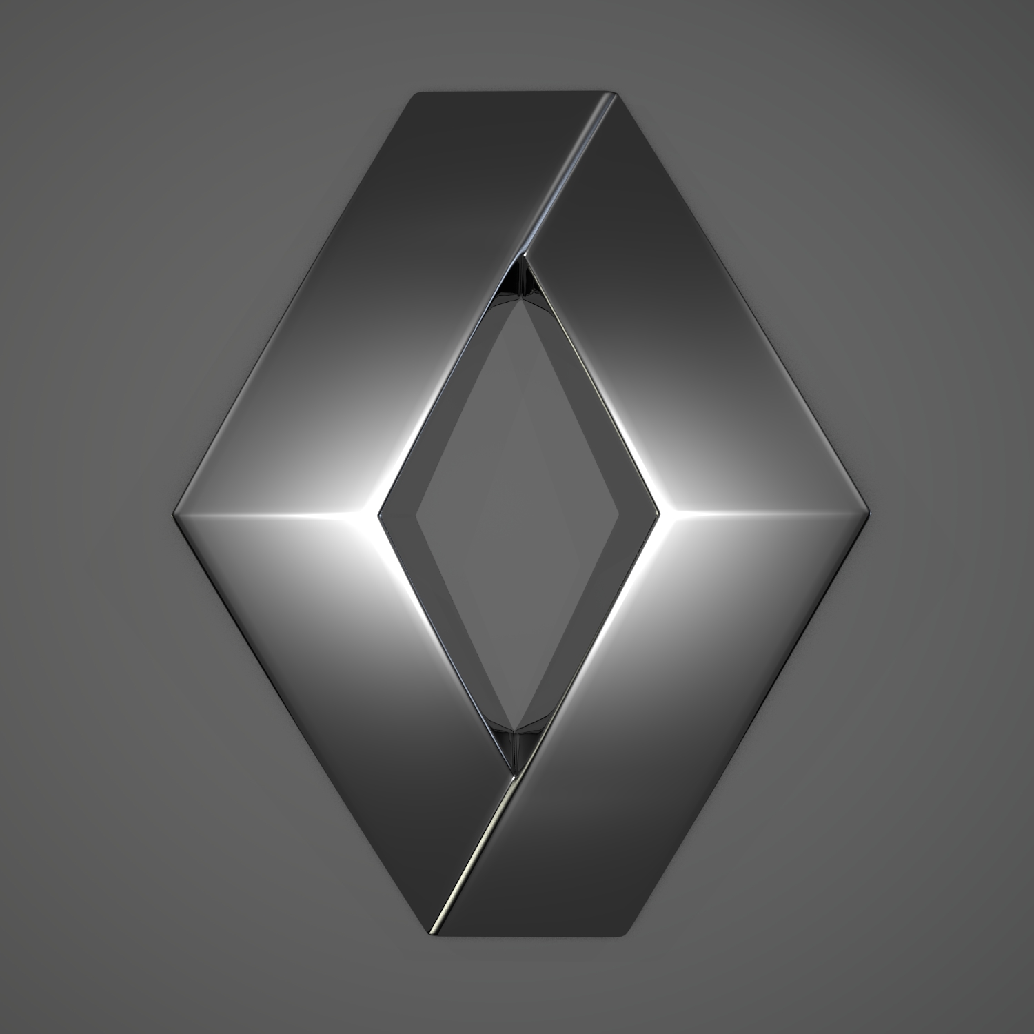
2021 – now
![]() The redesign of 2021 has removed the lettering from the Renault badge, and kept only a graphical geometric element — a thick black Diamond, drawn in straight intertwined lines with clean cuts. Those are two rhomboid outlines, overlapping each other some space between the bars, which create an airy yet very confident and strong image.
The redesign of 2021 has removed the lettering from the Renault badge, and kept only a graphical geometric element — a thick black Diamond, drawn in straight intertwined lines with clean cuts. Those are two rhomboid outlines, overlapping each other some space between the bars, which create an airy yet very confident and strong image.
Emblem
The current version of Renault emblem depicts the name of the company located on the yellow background made in shape of a square. Diamond figure is located on top of the company’s name. There have been a lot of argues whether to return yellow background or not. However French designer Jean-François Porchez had no doubts it would bring more dynamic and modern look to the badge. This version has been designed by Porchez in 2004 with several changed made in 2007. But the base and forms are still the same. There is also another version of the logo which depicts Renault MN where MN stands for the Wolff Olins consultancy firm.
Shape
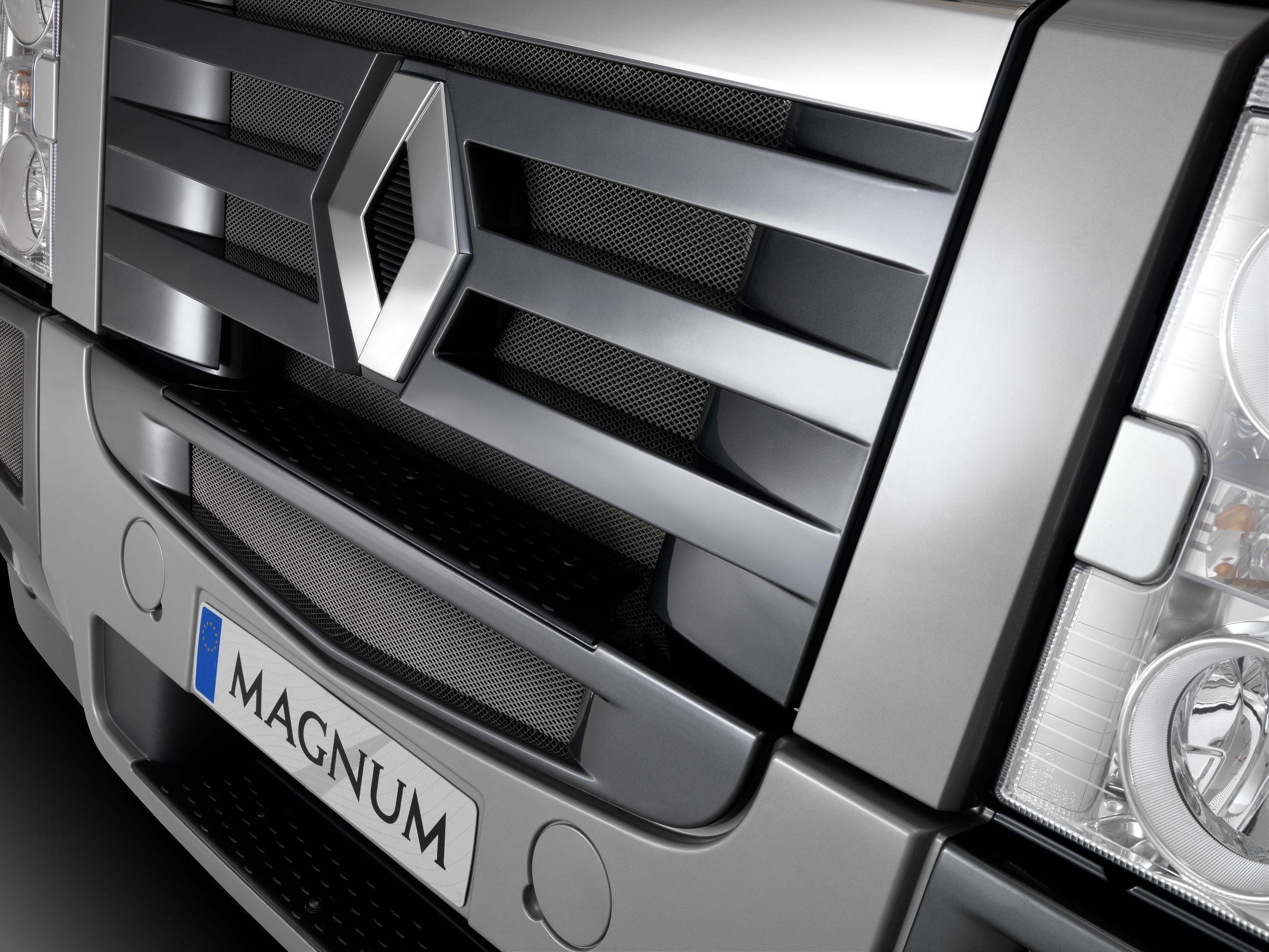
Every detail in Renault badge has specific symbol. When it comes to the shape of the logo we should firstly consider silver diamond which is located on top of the company’s name. Silver color was not chosen occasionally. It symbolizes creativity and sophistication of French car engineers. Every new model comes with innovations and latest techs which make these autos very popular with consumers all over the world. Few people know that several shapes have been used for this logo. They included circles and ovals. But in 1925 diamond was chosen once and for all with further slight modifications and changes.
Color
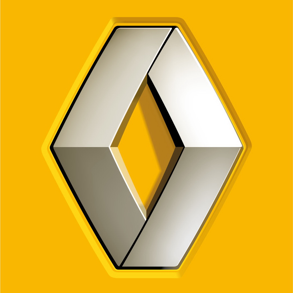
Yellow color was also chosen not accidently. It was already once introduced but later neglected by designers. However it was brought back in 2004 in order to represent optimism and prosperity. In addition yellow square turned out to be a good idea making the logo more eye-catching and recognizable.


-
 Taiwan car brands
-
 Romanian car brands
-
 Czech car brands
-
 Spanish car brands
-
 Dutch car brands
-
 Indian Car Brands
-
 Canadian Car Brands
-
 Russian Car Brands
-
 Swedish Car Brands
-
 Italian Car Brands
-
 American Car Brands
-
 Japanese Car Brands
-
 European Car Brands
-
 Chinese Car Brands
-
 Korean Car Brands
-
 Australian Car Brands
-
 British Car Brands
-
 French Car Brands
-
 German Car Brands