Audi Logo
![]() Audi Logo PNG
Audi Logo PNG
Audi AG is a German company that is part of the Volkswagen concern and produces cars under the Audi brand. In the global automotive market, its automobiles belong to a prestigious category. These cars are distinguished by a high degree of comfort, reliability, and stylish modern exterior and interior design. Each model has a whole army of sincere admirers. This concern has many branches scattered around the world.
Meaning and History
![]()
Audi was founded in 1909. The world-famous automobile brand owes its appearance to the German engineer August Horch. The first car was released a few months later. In 1928, Audi was bought by motorcycle manufacturer DKW. The familiar four-ring emblem appeared in 1932, when the Saxon Municipal Bank, which lent money to DKW, Horch, Audi, and Wanderer, came to the conclusion that in order to reduce financial risks, it was better to combine these companies into one. In 1949, the headquarters of the automaker moved to Ingolstadt. The company barely stayed afloat. In 1958, the concern was acquired by Daimler-Benz AG. Several years later, it was sold to Volkswagen, which still owns the brand.
1909 (prelaunch)
![]()
The initial Audi logo was a signature of sorts. They wrote the name in a cursive, seemingly hand-written style at an angle. Also, two lines extended from the first letter to the last below the word, and likewise above from the last letter to the first. It made the writing enclosed in this oval ring.
1909
![]()
The first real logo depicts a gear stick, colored mostly black and with some white. It looks like a ‘1’ digit, placed onto a domed pedestal, which is then located atop a downward triangle. The word ‘Audi’ is written at the top of the triangle in a similar style as before. The letters were lowercase here and colored white.
1909 – 1932
![]()
Much of the design stayed untouched. However, the name was rewritten with a simpler, linear style. It’s a sans-serif font with rounded forms. Both ‘A’ and ‘d’ have extended lines at their tops, but that’s where odd parts end.
1932 – 1949
![]()
This Audi emblem signs the association of the brand Audi with others: Horch, DKW, Wanderer: the initial ring from at the left side represents Audi, the next represents DKW, the third is Horch, then the fourth ring is Wanderer. Its congeniality to the Olympic logo caused the World Olympic Committee to pursue Audi in World Trademark Court, where they lost.
1949 – 1969
![]()
The Audi symbol is four ceiling rings that reflect the four manufacturers of Auto Union.
The 1949 logo also consists of four rings. This time, they made them thicker and removed white outlines where they fused, creating a continuous black image. They also removed the images inside the rings, replacing them with a long black nameplate in the middle. It extended from the middle of the first ring to the middle of the last one and included the name ‘Auto Union’ in white.
1969
![]()
The 1969 logo is just a nameplate, much like the one from the previous design, but standalone. It’s also not as tall and long, because they used fewer symbols here. The font is similar to the logo from 1909-1932, but there weren’t only lowercase letters here. It said ‘Audi NSU’ in white bold letters.
1969 – 1995 (badge)
![]()
The four rings depicted on the Audi symbol are remindful of the four oldest car makers in Germany that immersed together to found the company in 1932. Previously these motor vehicle manufacturers were independent. Their names are: Audi, DKW, Wanderer and Horch. These companies became the foundation pillars on which the modern AUDI AG is founded.
1969 – 1995
![]()
This emblem uses the same text style as the 1969 nameplate. There is a white word ‘Audi’, exactly as seen on that logo. They removed the ‘NSU’ part and replaced the rectangular base with an oval one, which still stayed black.
1978 – 1995
![]()
This secondary design used the same elements as the main logo. It was almost identical, except for the bright red instead of black. There was also an oval layer of white along the fringes.
1995 – 2009
![]()
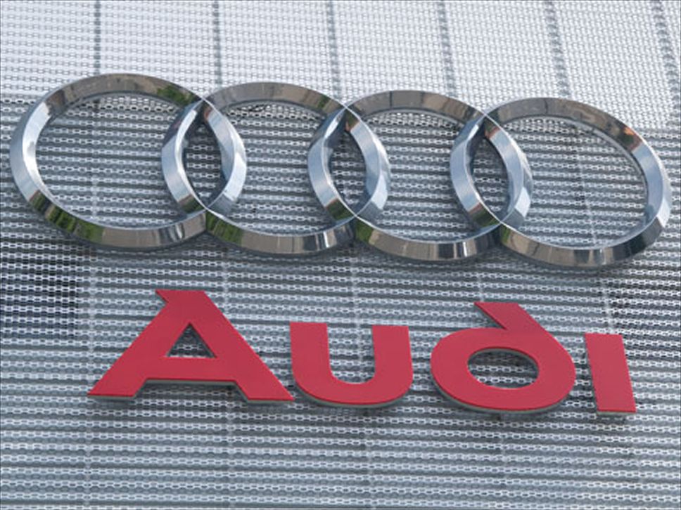
They combined the rings badge with the name emblem into one logo. The rings are metallic and look 3D. They seem a continuous object, where the rings are fused into one another and not placed behind or in front. As for the writing, the name is written in the same style, but with slightly shorter letters. The letters are red, a paler shade than an oval from one of the previous logos. The writing is located beneath the main emblem.
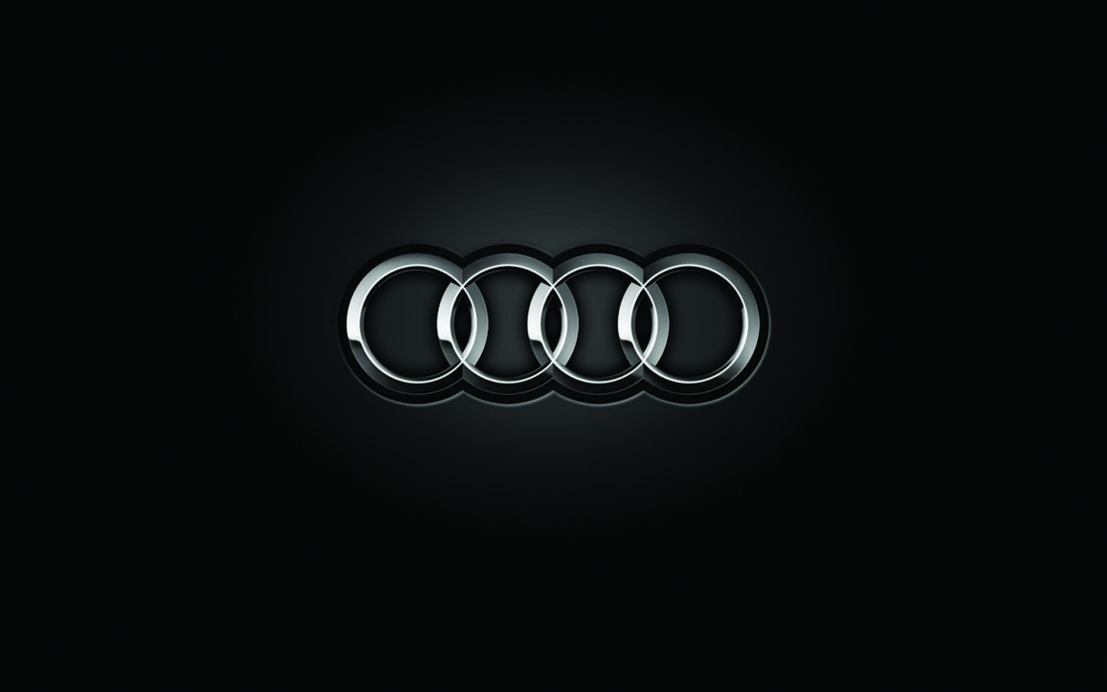
2009 – 2016
![]()
The Audi logo became recently modified some years ago, in 2009, on Audi’s 100th birthday. The minimal changes in the print, size, color and common appearance were made. The logo is created to sign “Vorsprung durch Technik”.
It means “Progress through Technologies”. The font used became now more standardized, which appears to become simple yet modern. This new appearance to the logo reflects a message from Audi to the customers and employees about rendering more innovative and effective designs. It is considered that the new manufacturer’s logo, implemented in 2009, tries for the whole company and further reinforces its bond with Audi’s customers. The Audi logo with its 4 rings identifies the Germany’s oldest-established automaker. It symbolizes the association in 1932 of 4 previously independent motor-car manufacturers: Audi, DKW, Wanderer and Horch. These companies initiate the roots of that is today AUDI.
2016 – today
![]()
The 2016 logo is a black imprint of the same rings, as seen in the previous logo. They don’t use the written name here, just the silhouette of the emblem in full black.
Shape
Company’s logo includes four three-dimensional overlapping rings that now appear more sharp-cut with the amount of a polished chromium look; reflect the 1932 fusion of Audi with Horch, DKW, Wanderer, and signs strength and security. This logo is a symbol of protection and power, depicting the 1932 fusion of Audi with 3 other noted manufacturers. The current look of the Audi symbol was presented in 2009, signifying the relentless efforts of the automaker to strengthen ties with their clients and ultimately increase efficiency, loyalty and superiority of the brand.
Color
Darker coloration used in Audi symbol added to it a more defined and shiny look. The aluminum color in the rings reflects innovative power and slight design, an Audi bottom competency that positions the brand apart. It is slick and bright which attaches it a sophisticated touch. The font depicts the look of more sleek, efficient and innovative designs. In a whole Audi’s color spectrum corresponds to the modern design technologies.
Emblem


-
 Taiwan car brands
-
 Romanian car brands
-
 Czech car brands
-
 Spanish car brands
-
 Dutch car brands
-
 Indian Car Brands
-
 Canadian Car Brands
-
 Russian Car Brands
-
 Swedish Car Brands
-
 Italian Car Brands
-
 American Car Brands
-
 Japanese Car Brands
-
 European Car Brands
-
 Chinese Car Brands
-
 Korean Car Brands
-
 Australian Car Brands
-
 British Car Brands
-
 French Car Brands
-
 German Car Brands