Subaru Logo
![]() Subaru Logo PNG
Subaru Logo PNG
The Japanese company Subaru Corporation is one of the leaders in the global automotive industry and specializes in the production of trucks and cars. It also implements projects in industrial engineering and aircraft building. In fact, few people know that initially, the brand did not want to produce cars for the general population, but began its history with the production of aircraft. The Subaru brand is widespread among the modern population. It is preferred by car enthusiasts for its fast driving, consistent all-wheel drive, and elegant style, as well as affordability considering all of the above characteristics. Subaru is one of the few Japanese auto brands whose production does not go beyond the land of the rising sun.
Meaning and History
![]()
When Subaru brand was launched as part of Fuji Heavy Industries in early 1950s, its founder, Kenji Kita, decided to name the japanese car company after the Pleiades star cluster of Taurus constellation, translated to Japanese. Pleiades, also known as Seven Sisters, is a cluster, composed of extremely luminous hot blue stars that can be visible with the naked eye in night sky.
Quite naturally, Subaru logo embraced the graphic representation of the star cluster. At the same time, the biggest star symbolized the parental company Fuji Heavy Industries, while the other five stars represented the companies that merged to create it, including the automobile division, the aerospace division, the Subaru Industrial Power Products division, the eco technology division and the buses and railroad cars division.
The logo has evolved since 1950s as the background color and disposition of the stars changed a number of times. Earlier versions featured a rather correct model of the cluster and interconnected stars. As Subaru designers were looking for successful logo variations, changes included gold design of the stars, red or speckled background and slight modifications of the circling silver oval. Later on the classic disposition of the Pleiades stars was replaced with a more attractive and organized structure that saw the biggest star move to the upper left side of the logo and the other five lining up in the bottom right corner.
1953 – 1980
![]()
The first corporate logo made by Subaru brand designers was a black oval badge. On it, there were 6 stars all connected to each other so they formed something what seems to be a constellation.
1953 – 1958
![]() They turned the black color to matte silver, which made a 3D effect, and lessened the oval and the stars.
They turned the black color to matte silver, which made a 3D effect, and lessened the oval and the stars.
1958 – 1959
![]()
For some time, they used this 3D oval enlarged and colored golden.
1959 – 1970
![]()
The next badge, introduced in 1959, got a silver frame, inside which they placed bright red area. The constellation stars were silver as well, but the lines connecting them were black and silver.
1970 – 1980
![]()
This logotype showed us starred oval, colored white with some inclusions of black. It was drawn over the gradient black and dark blue rectangle, a bit wider at the top. Inside the oval, there were also a variety of white dots.
1980
![]()
They just took the old 1953 logo and made its colors way bolder. They made a gray outline, which affected the oval itself and the lines connecting the stars. The lines of the stars changed their position as well. Now, the lower star was separated from the constellation.
1980 – 2003
![]()
The oval became narrower and more elongated. The designers changed the color to black for the oval and silver for stars and outline. The stars changed their positions, and now there was one huge star on the left, and five little stars on the right, all separated from each other. The 3D effect, by the way, didn’t disappear.
2003 – 2019
![]()
They again changed the logo. Now there were the stars connected by 2. The stars and frame for the oval turned to gradient silver, while the inner part of the oval changed its color to deep blue.
2019 – now
![]()
The latest Subaru emblem update saw the blue background become lighter and acquire gradient shades. The oval has gone more flattened.
The cars produced with this logo have become recognized throughout the world for their Symmetrical All Wheel Drive used in most vehicles, boxer engines and successful history in Motorsports, specifically World Rally Championship titles earned by Subaru Impreza WRX.
Description
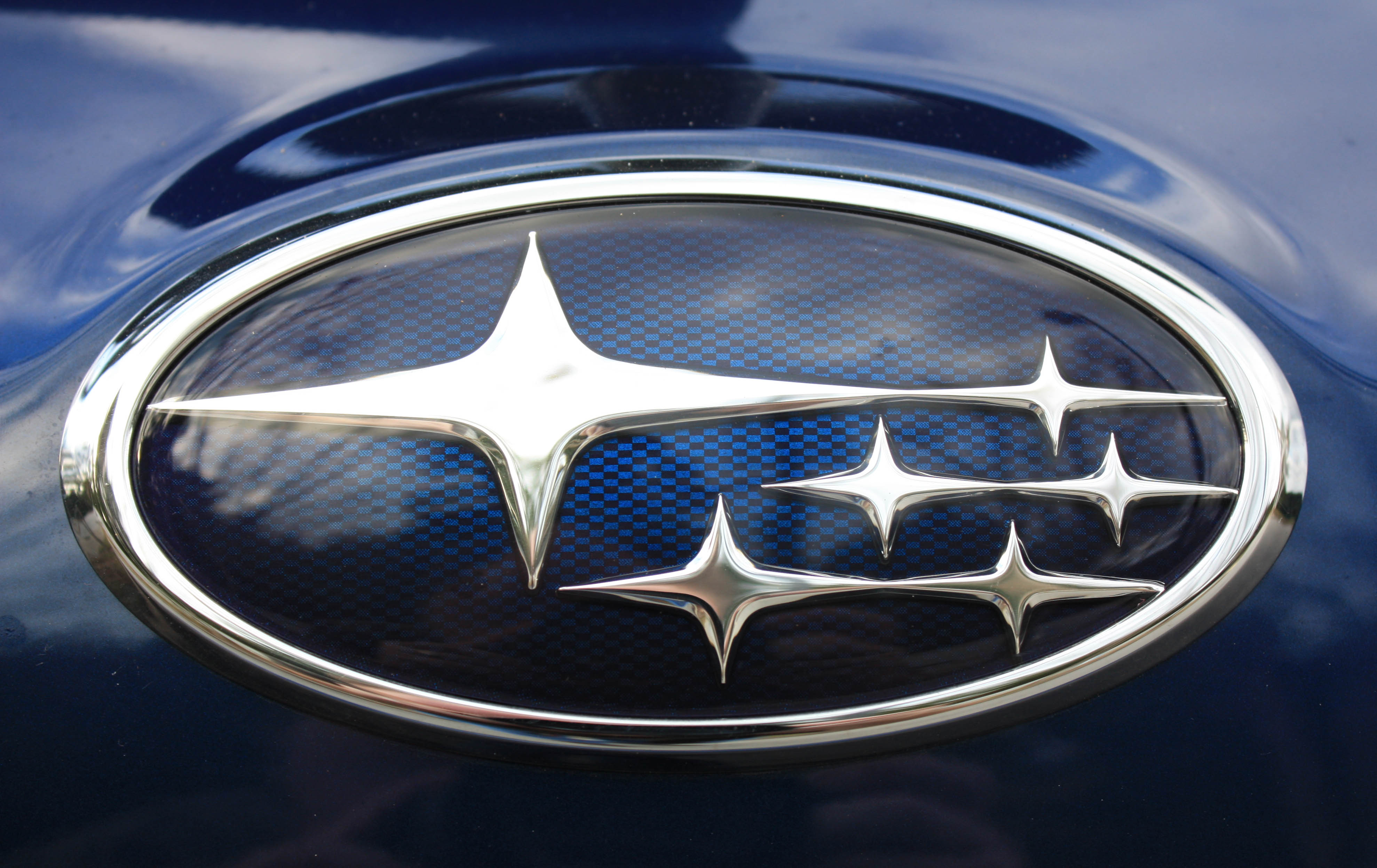
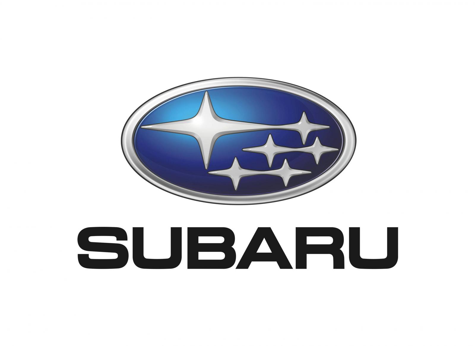
Subaru logo is a representation of the Pleiades star cluster in the constellation of Taurus. Six hot blue stars are neatly organized inside the dark blue background, standing for space or night sky. The big star on the left also represents Fuji Heavy Industries, while five smaller stars on the right stand for its subsidiaries, including Subaru, the automobile division.
Shape
![]()
The Subaru symbol is a flattened silver oval, containing six four-point figures, representing stars. The biggest star rises above the other ones in the upper left side of the logo, while the rest are combined nicely on the right. All of them actually have different sizes. Earlier emblems seemed less organized, but featured a more correct representation of the Pleiades star cluster.
Color
![]()
The colors of the Subaru logo are meant to symbolize the sight of the Pleiades star cluster in night sky. Silver stars lie on the deep blue background to form a somewhat romantic image. The oval, completing the logo, is painted silver. The earlier Subaru emblems featured black, red and gold colors, invariably matched with silver.
Emblem
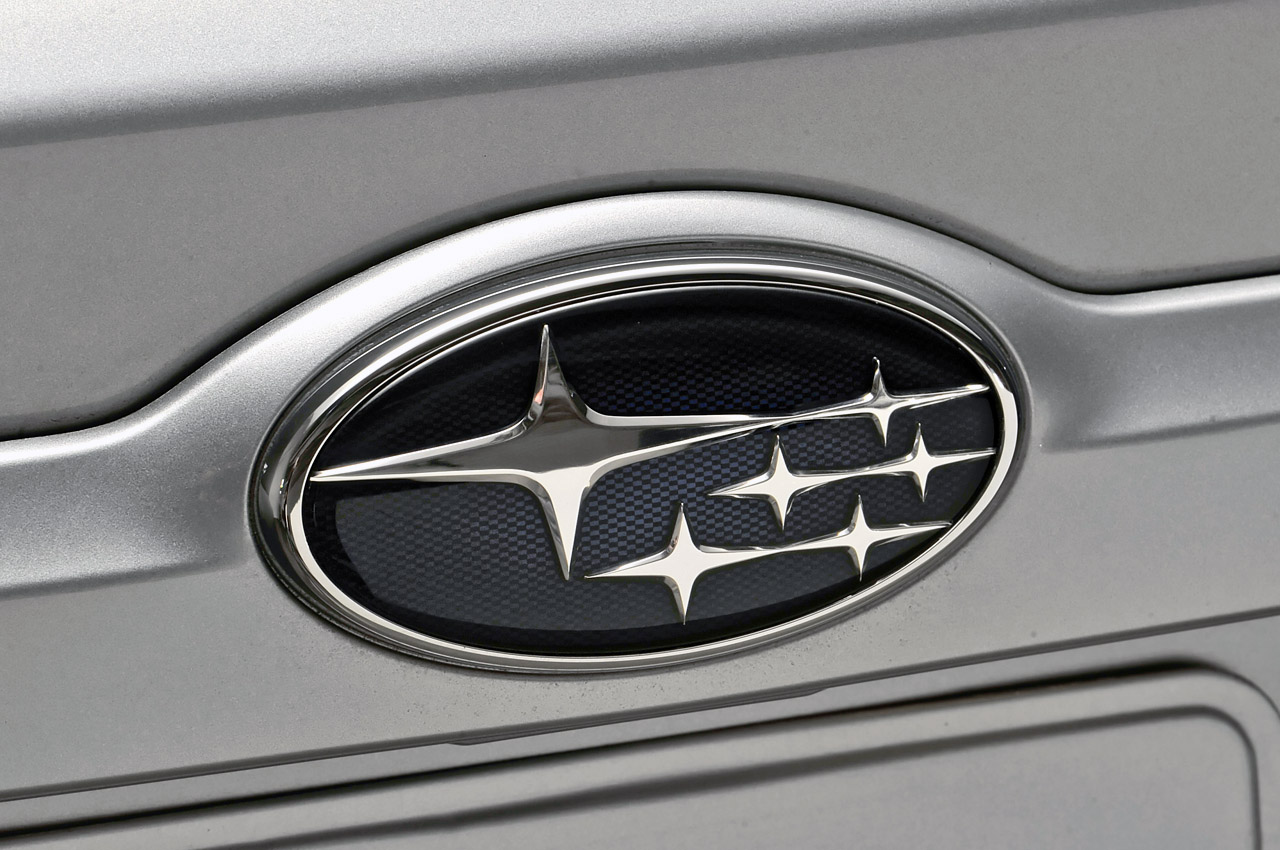
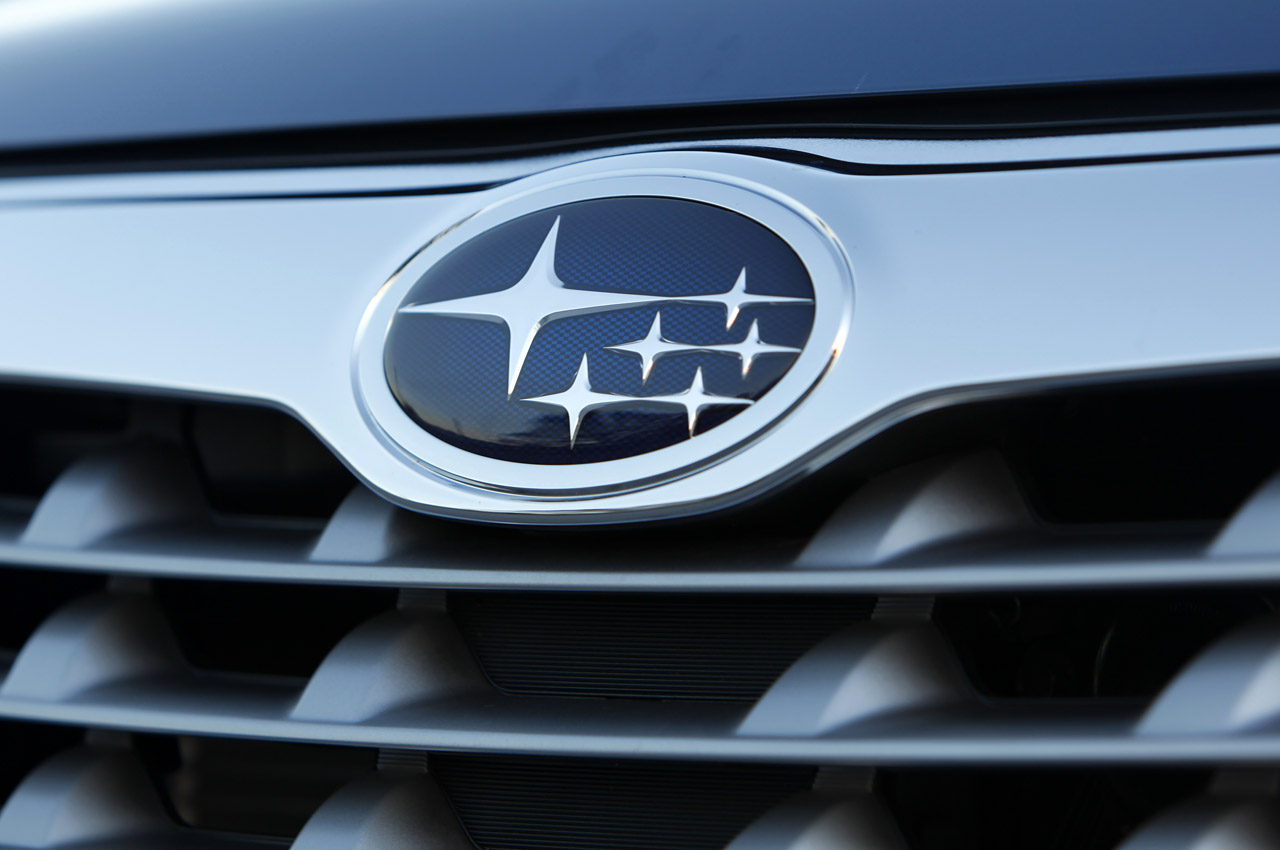
![]()
![]()
![]()
Official Subaru website: www.subaru-global.com


-
 Taiwan car brands
-
 Romanian car brands
-
 Czech car brands
-
 Spanish car brands
-
 Dutch car brands
-
 Indian Car Brands
-
 Canadian Car Brands
-
 Russian Car Brands
-
 Swedish Car Brands
-
 Italian Car Brands
-
 American Car Brands
-
 Japanese Car Brands
-
 European Car Brands
-
 Chinese Car Brands
-
 Korean Car Brands
-
 Australian Car Brands
-
 British Car Brands
-
 French Car Brands
-
 German Car Brands