Saab Logo
![]() Saab Logo PNG
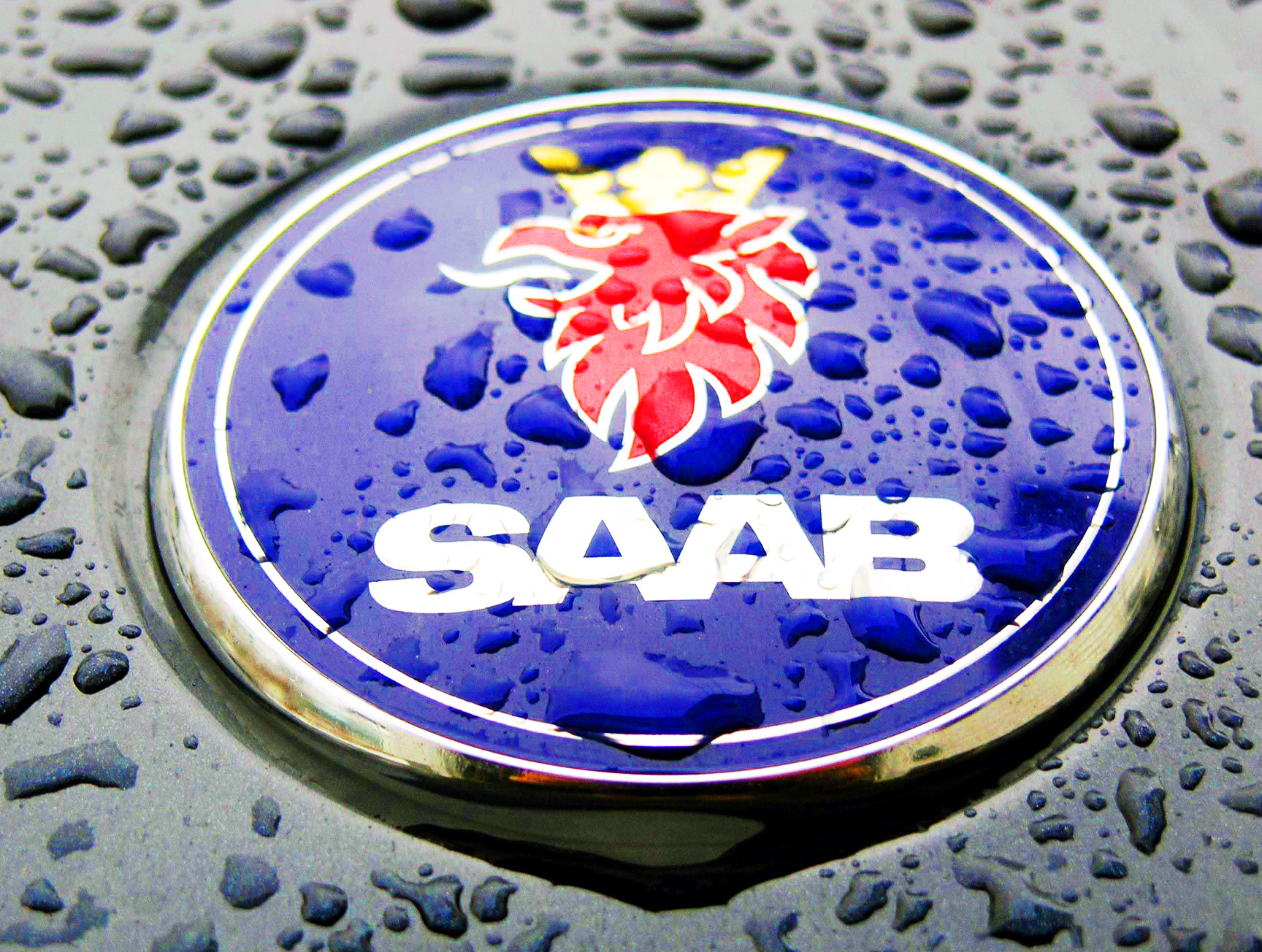
Saab Logo PNG
Saab company has a very long history, as well as his logotype. Let’s find out how Saab emblem changed throughout the century, and what it means.
Meaning and History
![]()
SAAB is a Swedish car company, whose name stands for Svenska Aeroplan AktieBolaget.
1891 – 1900
![]()
The first brand logo was a metal badge with the ‘Vabis’ inscription on it. The word is colored black and written in a sans serif font with large letters.
1900 – 1911
![]()
But it is worth noting that the very first emblem of this brand was “Tre krunor” – three yellow crowns on a blue background. The next logo depicted a three-ended part and a circle over it. The part was colored beige and had a variety of black dots, strokes on it and the ‘Malmo’ word at the top. There was also an image of crowned head of eagle at the center. The circle was colored black and had a triple beige-black & white outline. They wrote the inscription ‘Maskinfabriks Aktiebolaget Scania’
1911 – 1937
![]()
In 1911, they recolored the logo. Now it was deep blue with a golden outline. The three-ended detail got a yellow pattern similar to brickwork. The eagle was enlarged and its colors became much brighter. The whole logotype now was put inside a circular frame.
1937 – 1946
![]()
Its history begins in 1937 with the production of airplanes, and it was then that the first logo with the image of a twin-engine airplane with propellers and the inscription “SAAB” under it appeared.
The inscription was written in curve, colored black and had a slim sans serif type with large letters.
1946 – 1947
![]()
After the Second World War, the Swedes began to manufacture cars, and then the logo was changed – in 1946, a prototype of the model “92” with a red stamp in the form of a coat of arms – “The Ursaab Emblem” was produced. It was colored red and had a heavy frame. On it, we can see the ‘JC’ initials and some numbers.
1949 – 1963
![]()
In 1949, designers again remember the air past and a new logo appeared – the inscription SAAB is placed on a blue square with rounded corners, and under the inscription there are two chrome strips, stylized under the wings of the aircraft. The blue word has an elongated and thin font with large sans serif letters.
1963 – 1965
![]()
In 1963 wings are “separated” from the logo – the two-engine plane returned (front view). The logo was placed on the radiator false grille so that the wings of the plane fit into the cells of the grille. This emblem is very similar to the one that was in 1937, but the inscription itself has now lengthened. Above the plane, they placed their name that had an elongated, slim script with large angular letters.
1965 – 1967
![]()
In 1965, they renovated the logo, made more vivid and colorful.
1967 – 1969
![]()
In 1967, another major change took place – Saab Aktiebolag merges with Aktiebolag Scania-Vabis and the already renewed Saab-Scania company presents a new logo. The designers return to the twin-engine aircraft, which, together with the inscription “SAAB” above it, is placed on a well-known blue rectangle with rounded edges. Also, the inscription and the aircraft colors were turned white.
1969 – 1974
![]()
But since 1969, the SAAB grilles have only had a traditional inscription on them as a logo. It was colored dark blue, and had a heavy font with large angular letters connected to each other.
1974 – 1996
![]()
Ten years later, in May 1974, the company introduced a brand new logo with a crowned red griffin, a mythical creature with a lion body and an eagle head. The griffin was originally used on Scania logos and was borrowed from the Skane coat of arms. On the blue circular background, there were two circles, which intertwined each other. At the top, there was the ‘Saab’ inscription, while in bottom of the logo we can see the ‘Scania’ word.
1995 – 2000
![]()
In 1995, Saab shares were purchased by General Motors, and in 2000 by General Motors. “Saab-Scania breaks up and the SCANIA inscription disappears from the logo. Now there is only one white circle, which became an outline for a blue circle. At the center, we can see the griffin head and Saab inscription.
2000 – 2012
![]()
The new emblem is a circle with the logo “SAAB”, only in the first version it will be decorated in gray, and in the second – silver letters will be placed on a white background. The designers drew a bright spot on the circle and thereby made a 3D effect for it
2012 – 2014
![]()
The 2012 brand logo was the ‘Saab’ word, written in an uppercase sans serif type colored gray. In this inscription, the large letters were connected to each other.
Symbol
The Saab logotype is closely connected with the heraldry. The griffin is originally depicted on Skane coat of arms, which highlights the origins of the brand.


-
 Taiwan car brands
-
 Romanian car brands
-
 Czech car brands
-
 Spanish car brands
-
 Dutch car brands
-
 Indian Car Brands
-
 Canadian Car Brands
-
 Russian Car Brands
-
 Swedish Car Brands
-
 Italian Car Brands
-
 American Car Brands
-
 Japanese Car Brands
-
 European Car Brands
-
 Chinese Car Brands
-
 Korean Car Brands
-
 Australian Car Brands
-
 British Car Brands
-
 French Car Brands
-
 German Car Brands