Mini Logo
![]() Mini Logo PNG
Mini Logo PNG
Mini is a small car brand originally owned by the British Motor Corporation. The Mini Cooper has a very colorful history that has been going on for over 60 years. During this period, it became one of the most popular British cars. This car has received worldwide fame and love precisely because of its small size and very small price tag. It has second place in the ranking of outstanding cars of the twentieth century. The Mini Cooper has become a worldwide sought-after item. Everyone rode it, from The Beatles to Enzo Ferrari.
Meaning and History
![]()
Mini is a British car manufacturer, specializing in small cars that have become iconic throughout the world. When it comes to the brand’s logo, it is hard to distinguish particular emblems that were used at certain periods of time, and the reason for that is that the cars, produced under the Mini trademark, hardly ever had a centralized manufacturer, being produced by British Motor Company, British Leyland, Rover Group, BMW and other marques.
Besides, Mini cars have been vastly used as a base for custom vehicles by various tuning houses, and all of them applied different badges. Hence, there have been many emblems used on Mini cars before the company was finally consolidated under the BMW ownership in 2001.
It all started in the middle of 1950s when Great Britain faced the need for small economical cars that would be available for the masses and would have low running costs. It was the British Motor Corporation that engineered the first Mini in cooperation with Austin and Morris. Hence, the first Minis carried the badges of these two companies and were named Austin Seven and Morris Mini-Minor.
1959 – 1962
![]()
Mini’s earliest logo depicts a small round badge with a thick frame and a crest inside. Back then, the company was known as Morris. Thus, this name is placed onto the top half of the frame, in a curved line. The crest is a shield that includes a picture of a bull and three wavy lines beneath it. On either side from the badge, there is a long, wing-like shape each. They are essentially long rectangles that gradually grow narrower. Furthermore, several thin streaks separate the figures into several ‘feathers’.
1962 – 1969
![]()
In 1961 John Cooper built the first charged Minis and his name became closely associated with the brand as Mini Coopers went on to win a number of Rallies.
The company’s cars then changed the name to Mini Cooper and the winged badge that later went on to inspire the current logo, was used for the first time.
1968 – 1969
![]()
Similar to the previous design, this logo includes a black circle at its center, with two simplistic wings on each side. The circle holds the name of the company – ‘Mini’ – written in white, bold serif letters. The serifs are miniscule, and, although these characters are all uppercase, the first one is slightly larger. The wings are still a collection of four rounded lines, all with black borders and white insides. This time, they are much shorter than before.
1969 – 2001
![]()
In 1969 the company’s name was changed to the simple Mini and a new badge was designed. It was a shield with the company’s name on black background and white-blue ornament.
The next design is instead a shield with 6 tips. It’s divided into two unequal parts. The top one is smaller. It’s black and includes the name of the company. It’s written in tall white letters of a typical sans-serif style. The bigger bottom piece is a smaller shield bit inside a bigger shield. It’s mostly grey, save for two blue trapezoids inside. In addition, there is a thin layer of white just inside the borders of main shield.
2001 – 2018
![]()
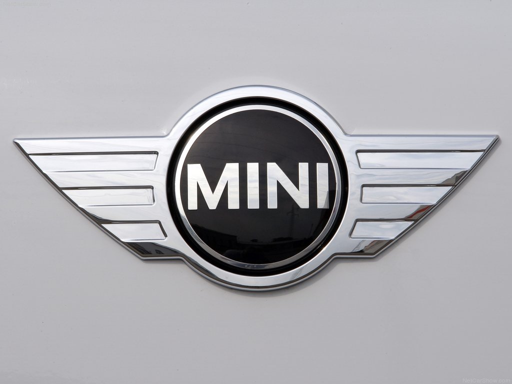
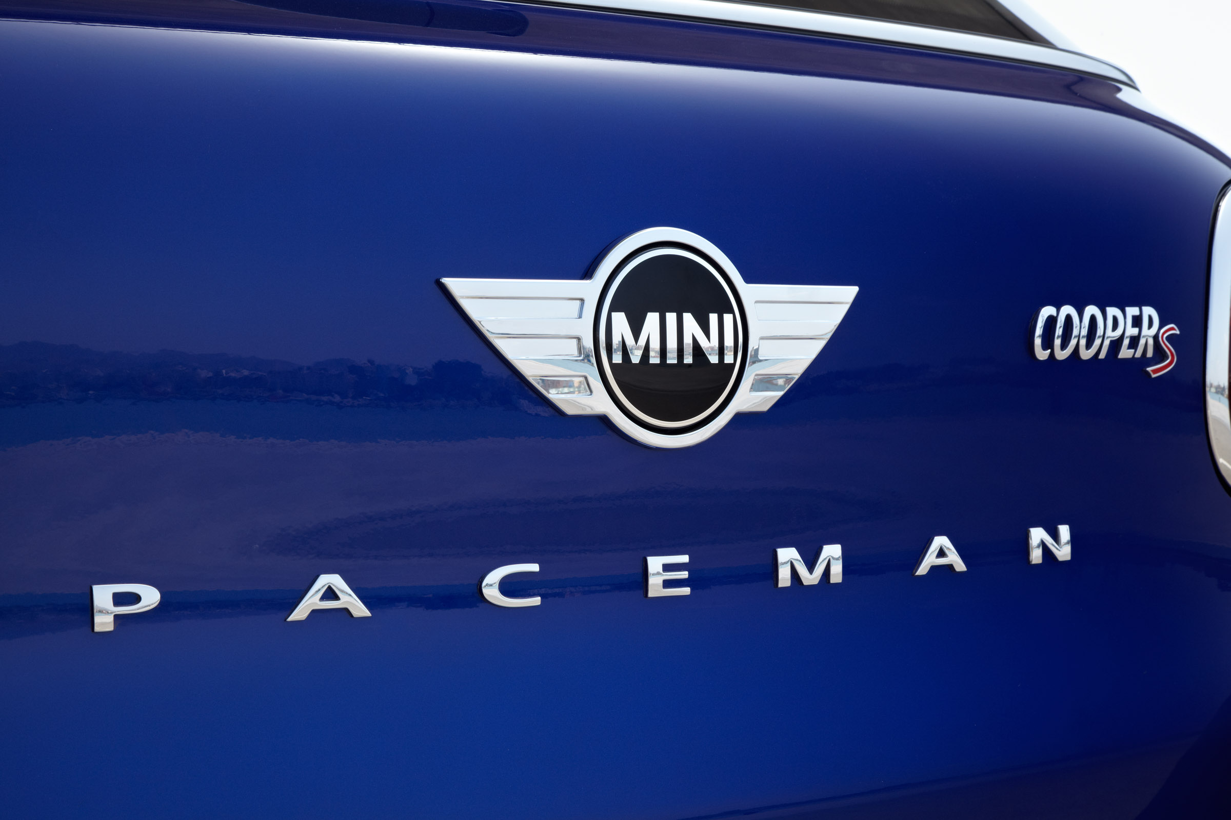
After the brand’s acquisition by BMW in 2000, the name was changed to MINI and the new logo was introduced. The black circle with the company’s name was placed between the sharp-edged wings and became the symbol of the brand’s rejuvenation and commercial success in modern world.
The wings extend forth from a metallic frame around the black circle, which fuses with the wings into one big form. The letters inside the circle are very similar to the ones in the shield design, but shorter and wider.
2018 – today
![]() The following design is a simplification attempt on the previous emblem. Except for the now-black name in the middle, there is just one other form, very simple in appearance. It starts with a single ring of black surrounding the white circle where the name is located. Then, it extends into eight lines, four on each side. They are similar to the ‘feathers’ from the previous design, but without additional space between them. Furthermore, the tips aren’t rounded, but abrupt and sharp.
The following design is a simplification attempt on the previous emblem. Except for the now-black name in the middle, there is just one other form, very simple in appearance. It starts with a single ring of black surrounding the white circle where the name is located. Then, it extends into eight lines, four on each side. They are similar to the ‘feathers’ from the previous design, but without additional space between them. Furthermore, the tips aren’t rounded, but abrupt and sharp.
Description
The Mini logo, used since 2001, is inspired by earlier logos and features the brand name, written in uppercase letters, placed inside an elegant black circle, which is embedded between the silver wings that symbolize speed and freedom of expression.
Shape
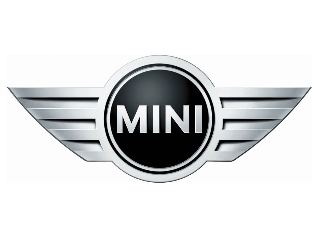
The black circle with the company name is adorned with silver and black rings, creating an impressive image. The wings, stretching on either side of the central part, feature razor-shape design and horizontal 3D lines. All that makes the logo look edgy and stylish.
Color
The current Mini emblem is designed in several shades of black and silver colors. While the silver color is quite popular with car manufacturers and highlights sophistication and grandeur, the black adds elegance, strength and excellence to the logo.
Emblem

![]()
![]()
![]()
Official Mini website: www.mini.com


-
 Taiwan car brands
-
 Romanian car brands
-
 Czech car brands
-
 Spanish car brands
-
 Dutch car brands
-
 Indian Car Brands
-
 Canadian Car Brands
-
 Russian Car Brands
-
 Swedish Car Brands
-
 Italian Car Brands
-
 American Car Brands
-
 Japanese Car Brands
-
 European Car Brands
-
 Chinese Car Brands
-
 Korean Car Brands
-
 Australian Car Brands
-
 British Car Brands
-
 French Car Brands
-
 German Car Brands