Lincoln Logo
![]() Lincoln Logo PNG
Lincoln Logo PNG
Lincoln Motor Company is an American manufacturer of cars, crossovers, and SUVs, which is owned by Ford. It specializes in the production of luxury cars. Lincoln is one of the few American brands that, having crossed the 100-year mark, survived the era of ruthless liquidations and takeovers. Though little known in Europe, the brand is still afloat with a range of expensive models and a presence in the world’s largest markets.
Meaning and History
![]()
Lincoln is a popular brand with rich history which is now a part of Ford Motor Company. It was always famous for its luxury cars which were desired by celebrities, politics and representatives of royal families. Lincoln autos have always been associated with premium class, luxury, comfort and power. Continental is probably the best known model of this famous brand.
Founded 1915 by Henry M. Leland who also created Cadillac brand the company made its way to the top list of American automakers and introduced actually the first luxury cars which hit the headlines of the automotive industry. The brand got its name after Abraham Lincoln. First cars turned out to be rather successful. And at short notice Lincoln brand became a synonym to luxury and power representing pure American style. It managed to conquer wealth segment which was a rather tough challenge at that period of time.
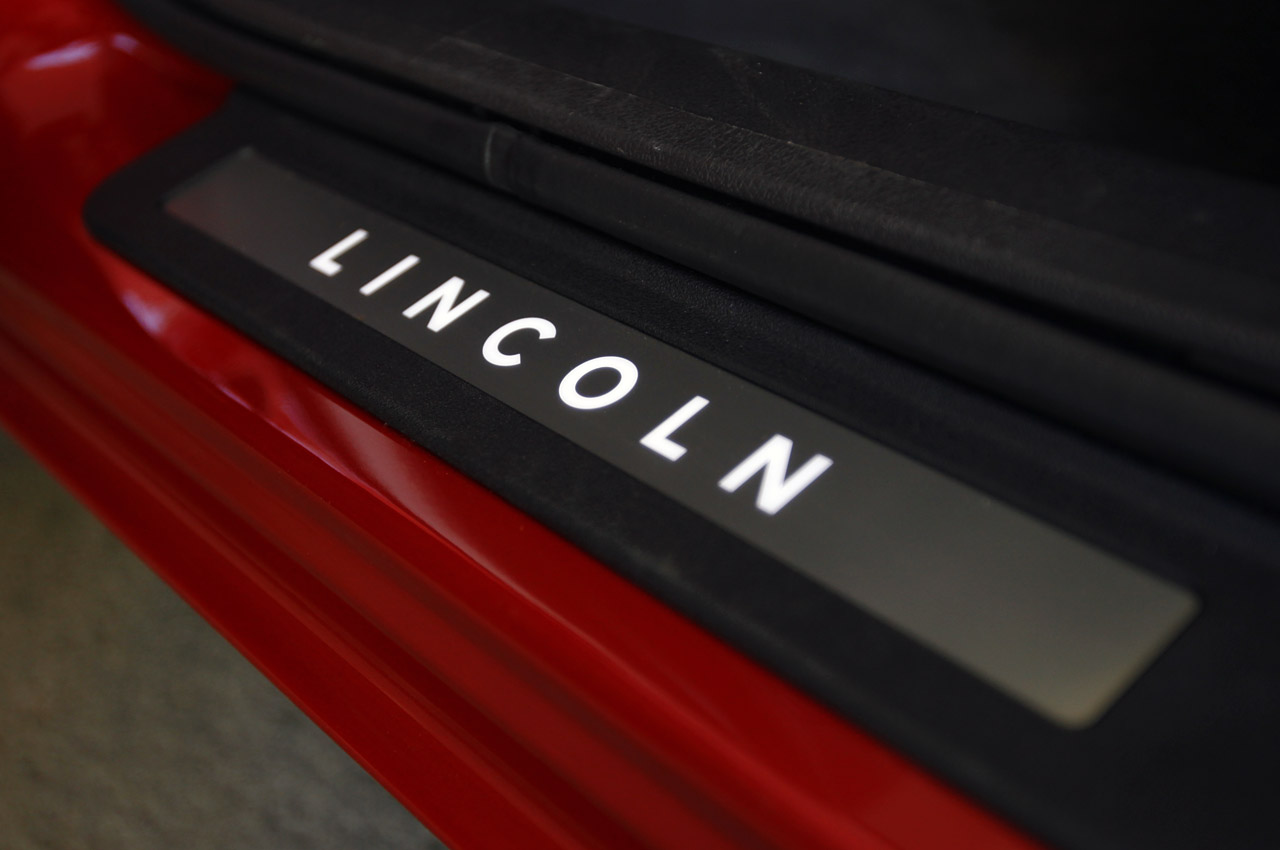
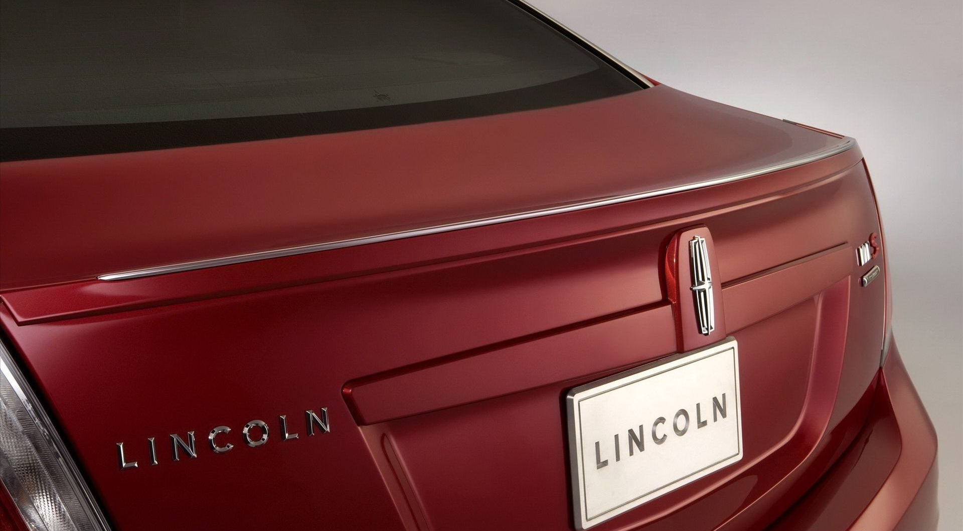
Speaking about logo, it is rather simple in comparison with badges of other car brands. It does not contain complicated elements and represented as Lincoln star. There are several versions of the origin of its symbol.
Some say that the sign was made in form of a compass while others stick to theory that it is a star. The final version of the logo was officially registered during50’s after several changes and modifications. The main feature of the badge is the fact that in spite of its simplicity it is eye-catching and recognizable among all fans of luxury limousines. It made a great impact on sales increase obtaining good reputation for the company. In other words Lincoln star turned out to be a successful advertising campaign. It represents prestige and elegance in every detail.
1917 – 1922
![]()
In 1917, they introduced a badge as their first proper logo. It was a vaguely oval shape with additional extensions in the top and bottom, as well as unusual curvature here and there. In appearance, it seemed metallic. The central oval bit was encircled by a frame that resembled a ribbon with two laurel branches at the bottom. Inside the frame, they placed the word ‘Lincoln’ in big serif letters. The two extensions looked like two halves of a single shield. The top bit held the words ‘Leland-built’. The bottom one had vertical stripes that alluded to the American flag.
1922 – 1939
![]()
The 1922 logo was an ellipse with several layers of frame around it. In its center, there was the same ‘Lincoln’ wordmark in black letters. Above it, they placed a smaller word ‘Ford’ in a cursive font that resembled that company’s wordmark at the time. Beneath, the word ‘Detroit’ was written in a more mundane serif, all letters capitalized.
1939 – 1954
![]() This time, they introduced a black circle as an emblem. There were two main elements inside it. One was the word ‘Lincoln’ near the top. They wrote it in white letters and in a cursive, elegant font. The other bit is what seems to be the family crest of the founder: a tall shield with various striped and dotted patterns in it.
This time, they introduced a black circle as an emblem. There were two main elements inside it. One was the word ‘Lincoln’ near the top. They wrote it in white letters and in a cursive, elegant font. The other bit is what seems to be the family crest of the founder: a tall shield with various striped and dotted patterns in it.
1954 – 1964
![]() It’s in many ways the same emblem, but colored this time. They added a big brown frame around the circle and turned much of the inner area purple. That doesn’t include the white brand name, as well as the shield, which has its own color palette (which includes red, white and blue). The bottom third of the circle is also occupied by a section of several ring layers. They are incomplete and cut short near the top of the shield.
It’s in many ways the same emblem, but colored this time. They added a big brown frame around the circle and turned much of the inner area purple. That doesn’t include the white brand name, as well as the shield, which has its own color palette (which includes red, white and blue). The bottom third of the circle is also occupied by a section of several ring layers. They are incomplete and cut short near the top of the shield.
1964 – 1972
![]() A new stylistic drawing was adopted in 1964 as the brand’s logo. It depicts a sort of cross with two thin, equal lines. There is also a vertical rectangle, incorporated into the center of this contraption in such a way that the lines divide it in four parts. Furthermore, there are two additional lines, set inside the horizontal bit of the cross. They are tall bars that resemble the letter ‘I’ with serifs on each end. The whole drawing is rotated a bit so that you can see the image at a perspective.
A new stylistic drawing was adopted in 1964 as the brand’s logo. It depicts a sort of cross with two thin, equal lines. There is also a vertical rectangle, incorporated into the center of this contraption in such a way that the lines divide it in four parts. Furthermore, there are two additional lines, set inside the horizontal bit of the cross. They are tall bars that resemble the letter ‘I’ with serifs on each end. The whole drawing is rotated a bit so that you can see the image at a perspective.
1972 – 2012
![]() They used parts of the previous design in this one. There is a smaller black image that resembles the cross contraption from before, packed with a rectangle. Here, it’s easier to see that it’s slightly bloated. They also made the shapes much more simple and smooth. On this logo, it serves as a small emblem above the brand’s name. The latter is written using thin, capitalized letters in a simple sans-serif font. The characters are placed a large distance form one another.
They used parts of the previous design in this one. There is a smaller black image that resembles the cross contraption from before, packed with a rectangle. Here, it’s easier to see that it’s slightly bloated. They also made the shapes much more simple and smooth. On this logo, it serves as a small emblem above the brand’s name. The latter is written using thin, capitalized letters in a simple sans-serif font. The characters are placed a large distance form one another.
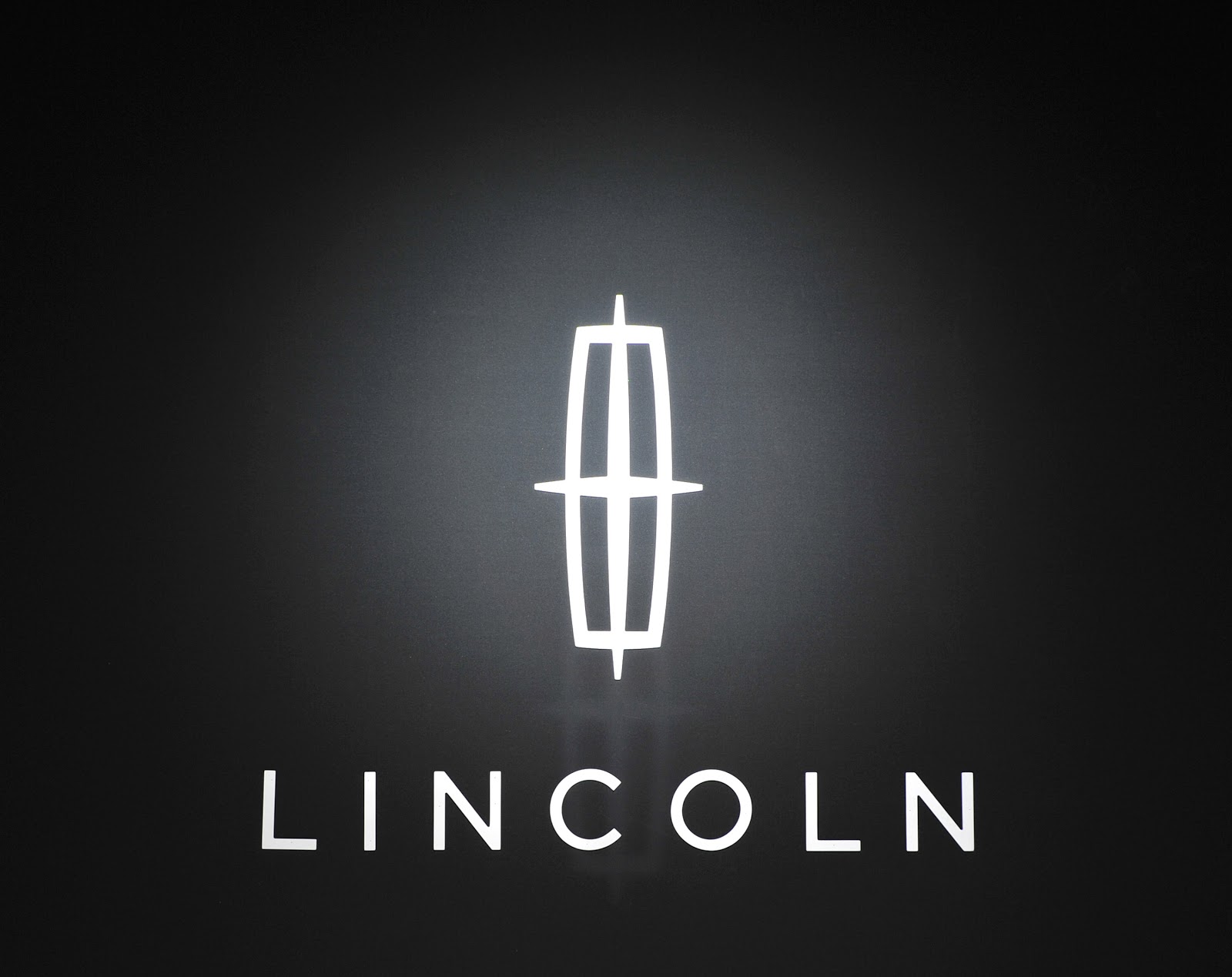
2012 – today
![]()
Description

Lincoln logo is presented in shape of an unusual compass with hands directed to every part of the world. The main idea was to show the eagerness of the company to conquer not only American automotive market but also sell Lincoln countries worldwide. Frankly speaking, such strategy turned out to be rather successful. Luxury cars of this brand can be found in all parts of the world without any exception.
At the same time few people know that there is another special version of Lincoln logo. The badge is called Cobra Star and based on the official logo of the company. But it has several additional elements including snake and Shelby logo. Such badge can be found on bodies of pimped autos produced by Lincoln Motorsport. They include Lincoln Mark VIII which actually has the same V8 4.6-liter engine under its bonnet as in Ford Mustang Cobra.
Shape
It is still unknown what the origins of Lincoln logo shape are. Some people say that badge represents compass with hands that are forwarded to all four parts of the globe. At the same time some people say that logo has an official name which is Lincoln Star. The idea of such design was to reflect something bright, luxurious and prestigious. That is why Lincoln autos are mostly associated with elegance, comfort and power. In addition there is another version that logo does not have any serious background. The only aim is to indicate that it is Lincoln star is standing in front of you. There are still lots of argues concerning the origin of the luxury cars symbol.
Color
The color of Lincoln logo is silver. It is mainly used for Lincoln Star which is located above the company’s name. This color reflects elegance, luxury and unique style which can be found in every model produced by this world’s famous automaker.
Emblem
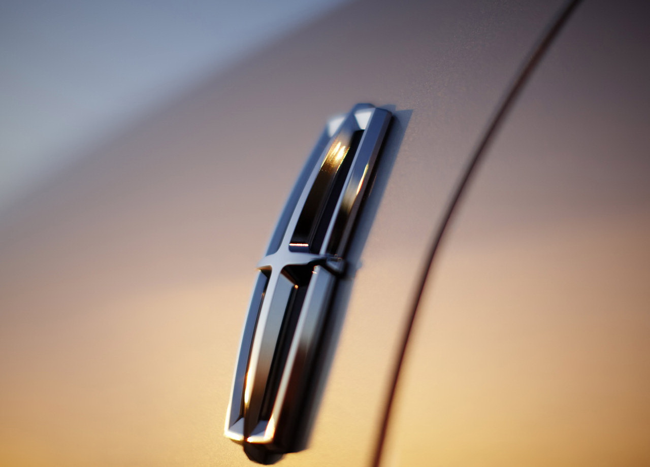
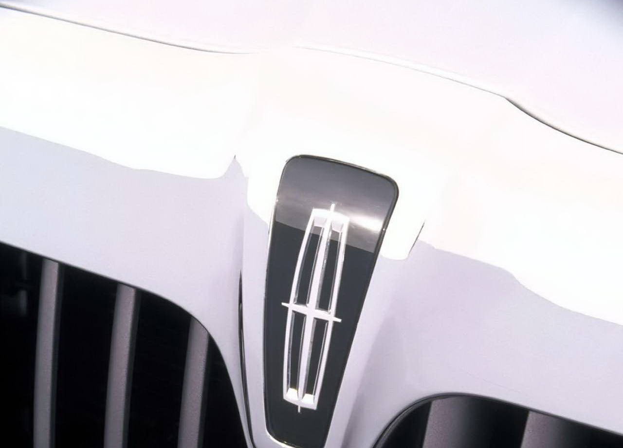
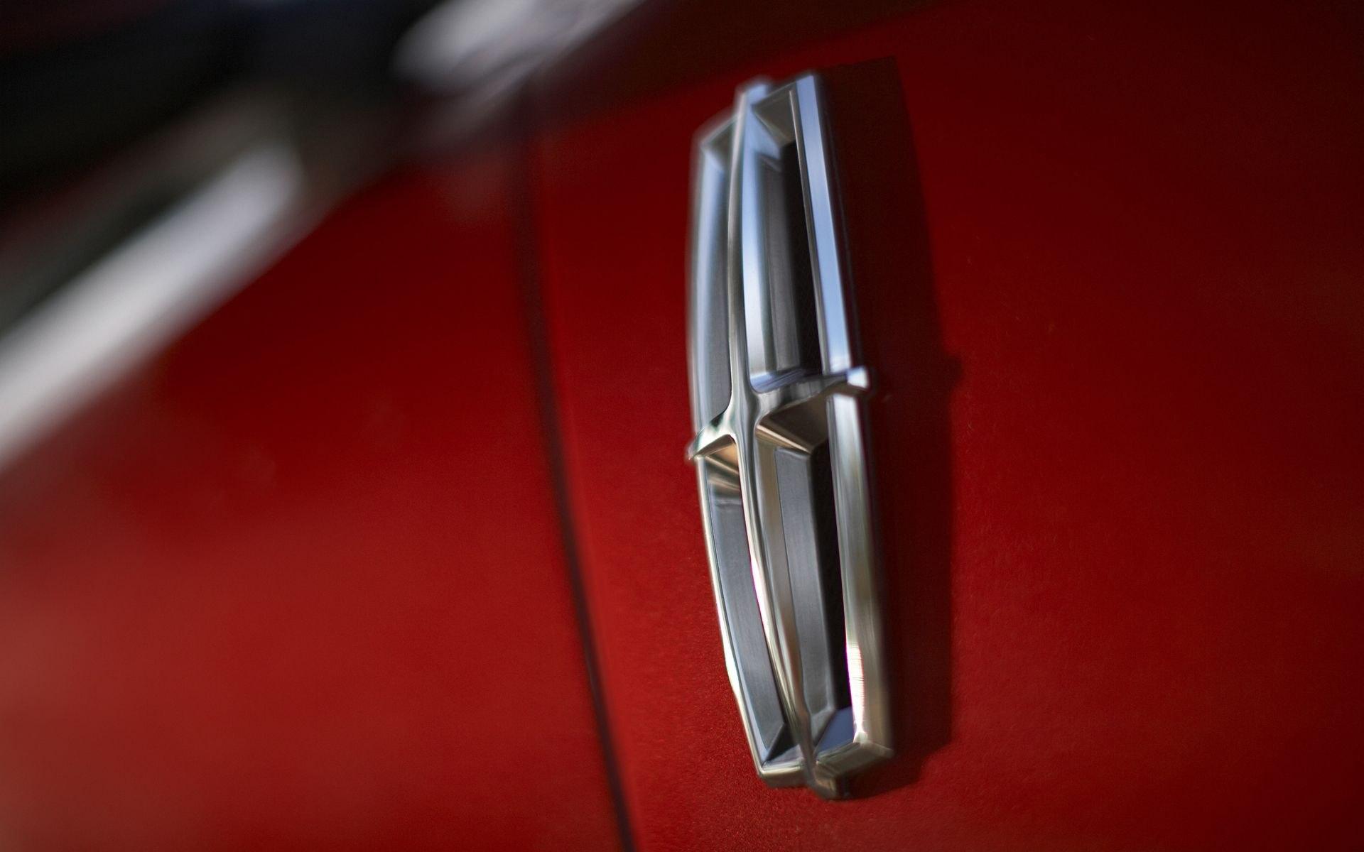
![]()
![]()
![]()


-
 Taiwan car brands
-
 Romanian car brands
-
 Czech car brands
-
 Spanish car brands
-
 Dutch car brands
-
 Indian Car Brands
-
 Canadian Car Brands
-
 Russian Car Brands
-
 Swedish Car Brands
-
 Italian Car Brands
-
 American Car Brands
-
 Japanese Car Brands
-
 European Car Brands
-
 Chinese Car Brands
-
 Korean Car Brands
-
 Australian Car Brands
-
 British Car Brands
-
 French Car Brands
-
 German Car Brands