Kia Logo
![]() Kia Logo PNG
Kia Logo PNG
KIA is a well-known car manufacturer from South Korea that is part of Hyundai Holding. It manufactures passenger cars, crossovers, SUVs, and commercial vehicles. According to information from the company itself, the name comes from two characters: “ki” (起, get out) and “a” (亞, which means (East Asia). It can roughly be translated as “Get Out of Asia”, sometimes interpreted as “Out of Asia into the whole world”. Today, this South Korean auto concern is the second automaker in its country and the seventh in the world. KIA has manufacturing facilities on every continent, except Australia. Interestingly, many KIA models are named after geographical features. For example, Cerato is translated from Greek as “peak”, Sorento is a city in Italy, while Mohave is a desert in the USA.
Meaning and History
![]()
Kia Motors, commonly known as Kia, is the second-largest South Korean manufacturer of automobiles and one the top car brands in the word, selling over three million vehicles annually. However, the company has had a thorny way to success as it started the business in 1944 as a manufacturer of bicycle parts. Later on Kia went on to produce complete bicycles, Honda-licensed motorcycles and Mazda-licensed vehicles. The first cars built under Kia brand came out in 1973.
At the same time, Kia uses a different logo in several regions, including the domestic Korean market. It features a stylized ‘K’ letter on blue background. This composition is embedded into the black circle which also has the Kia Motors wording written on it.
In late 1980s Kia expanded to the North American market and began to sell its cars under Ford nameplate. In 1992 Kia launched its own models in the US market, including Sephia and later on Sportage. In 1997 Kia went bankrupt but was salvaged by fellow-Korean manufacturer Hyundai Motor Company that acquired 51% of the company’s shares. Kia Motors went on to revive and turn into one of the leaders in the industry.
1953 – 1964
![]()
As long as the company went from on area of activity to another, the logo has developed as well. As a bicycle manufacturer, Kia used a triple-diamond emblem, similar to that of Mitsubishi Motors, but containing a gear and a small diamond with the company’s name inside. That logo was designed in black color. The name used thin sans-serif letters, all capitalized. They were rather tall, but else was really special about them.
1964 – 1986
![]()
In the 1960s, as Kia started produced licensed vehicles, a green circle was adopted as an emblem.
In 1964, they adopted a simpler logo. It was a green ring with an additional green line that extended from the center of the emblem towards its top right section and beyond. It ended in a sharpened tip and resembled the number ‘7’ somewhat, although some parts were joined the circle. Both elements may be a reference to the company’s Korean name that reads as ‘기아’.
1986 – 1994
![]()
In the 1980s a new logo that consisted of blue-colored Kia name, was used.
The next evolution has more of a geometric style. It’s basically an English version of the company’s name, written in largely purple letters. They consist of as few blocky forms as possible. For instance, the ‘I’ is just a line, while the ‘A’ is a little hook shape. The ‘K’ consists of a line, a smaller triangle and a wavy turquoise line that extends above the rest of the word. This combination is supposed to mean a pipe with fumes coming out of it.
1994 – 2012
![]()
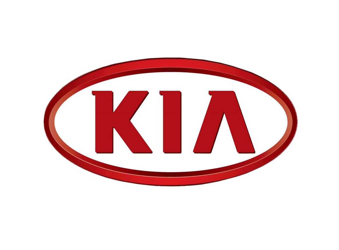
It was not before the beginning of the 1990s that the red Kia logo we are all used to was designed. The company’s name, printed in red letters and featuring a stylized ‘A’ without a horizontal bar was placed inside a red ellipse. This emblem has become part of the brand’s identity and is still used today with minor changes.
2012 – 2021
![]()
The 2012 logo version uses exactly the same images as the previous logo, except with a lighter, brighter color red. The oval also lots some of its width in some places, but that’s largely it.
2021 – today
![]()
In 2021, they introduced a new design of the brand’s name in the same color as the previous one used. The letters consisted on long strokes that marginally reminded of the three letters they used for their logo. These letters are more artistic. For instance, the letter ‘A’ is just two lines: one upright, one connected to it at an angle. What’s more, all of these letters are connected to one another via the two tips of the letter ‘I’.
Description
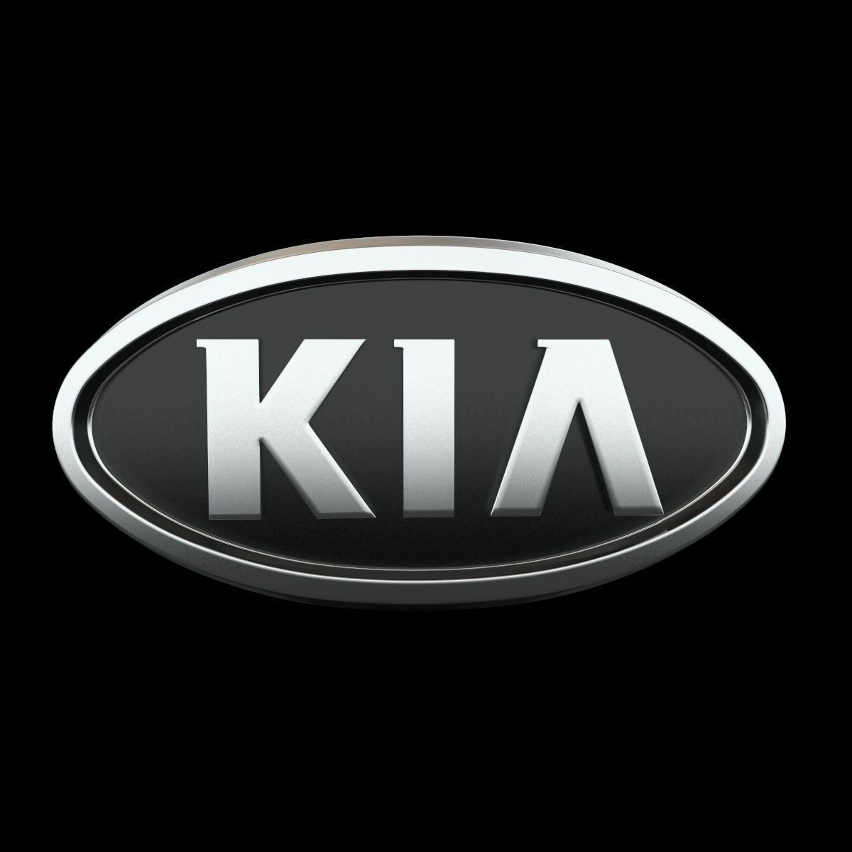
The current emblem of Kia is very simplistic, featuring the company’s name placed on red background, embedded into the silver oval. However, the KIA logo has a specific feature that makes it particularly recognizable: the A letter misses the horizontal bar.
The color of the font and background may vary between silver, red, white and black depending on the application. The name of the company can be deciphered as ‘emerging out of Asia’, if translated from Korean.
Shape
Kia logo is designed as a horizontally positioned ellipse, while the letters composing the company’s name are printed in custom font, specifically made for Kia Motors.
Color
The corporate colors of KIA Motors are red and white. However, this palette was only adopted in the 1990s. White color is said to be representing purity, elegance and transparency towards the clients, while red exposes the brand’s determination in rapid development and makes part of the company’s slogan ‘The Power to Surprise’.
Emblem

![]()
![]()
![]()
Official Kia website: www.kia.com


-
 Taiwan car brands
-
 Romanian car brands
-
 Czech car brands
-
 Spanish car brands
-
 Dutch car brands
-
 Indian Car Brands
-
 Canadian Car Brands
-
 Russian Car Brands
-
 Swedish Car Brands
-
 Italian Car Brands
-
 American Car Brands
-
 Japanese Car Brands
-
 European Car Brands
-
 Chinese Car Brands
-
 Korean Car Brands
-
 Australian Car Brands
-
 British Car Brands
-
 French Car Brands
-
 German Car Brands