Jaguar Logo
![]() Jaguar Logo PNG
Jaguar Logo PNG
Jaguar (Jaguar Land Rover Automotive PLC) is one of the legendary British car brands that, compared to many of the great and glamorous names in history, still exudes sports spirit and nobility. It is known for its stylish, graceful, and fast cars. It gained popularity thanks to the racing success of the 50s and the cars that combined unique technology and outstanding speed. Today, the creators of the Jaguars are driven by the same values and goals as the founders of the company – the desire to make cars that would be almost like living creatures. These automobiles are flexible, fast, and agile, cars that move like their namesake – the Jaguar. The company has had ups and downs, but now it is fulfilling its good name by releasing beautiful and fast cars. Jaguar turned to its past to keep the brand moving forward.
Meaning and History
![]()
1922 – 1935
![]()
Jaguar was founded in 1922 as Swallow Sidecar Company and the first vehicles produced by the British entrepreneurs carried the “SS” badge on the hood. “Jaguar” was added to the name in 1935. At this point, the company used a blue circle badge with two beige wings on the sides. There was a red ring layer just inside the borders of the circle. Further inside, there was the name of the company, also written in beige. These words were written at an angle and used a lightly cursive font.
1935 – 1945
![]()
In 1935 the company was still named Swallow Sidecar, so the SS monogram took the central place on the new badge. It was a sharp geometric style of the contours, supported by the angles of the hexagon it was written on, and the straight lines on the wings, coming out of it to the sides. The straight lines of the badge were softened by an arched banner with the uppercase “Jaguar” lettering on it, placed at the bottom of the brown badge.
1945 – 1951
![]()
The post-war version of the Jaguar badge got the SS monogram removed and the brand was finally renamed. The logo featured a narrow horizontally-stretched hexagon, contoured in black and enclosed between the two geometric wings, also in black-and-white. The bold uppercase “Jaguar” inscription was written across the hexagon in a bold custom font.
1951 – 1957
![]()
The redesign of 1951introduced a simplified, yet extremely sophisticated badge, with the uppercase serif inscription set in black on a white background. The custom font of the lettering looked very stylish and fancy, brilliantly representing the brand and literally yelling “quality and chic”.
1957 – 1982
![]()
In 1957 the British automaker has introduced a new version of the logo, with the golden head of a Jaguar cat drawn in the center of a lm orange roundel with a thick black frame. The frame was outlined in gold from both sides, and had the gold uppercase inscription written around it in a fancy serif font, looking elegant and expensive.
1982 – 2001
![]()
It was not before the end of the war in 1945 that the “SS” part was removed from the logo for political reasons, meaning that the company would be named Jaguar Cars. In search of a stylish emblem to guide the brand into the future the company’s designers introduced the notorious jumping jaguar. It was a semi-realistic outline of the predator, depicted mid-jump. Beneath it, and to the left, there was the name ‘Jaguar’, written with green letters with smooth, small serifs.
2001 – 2012
![]()
2012 – now
![]()
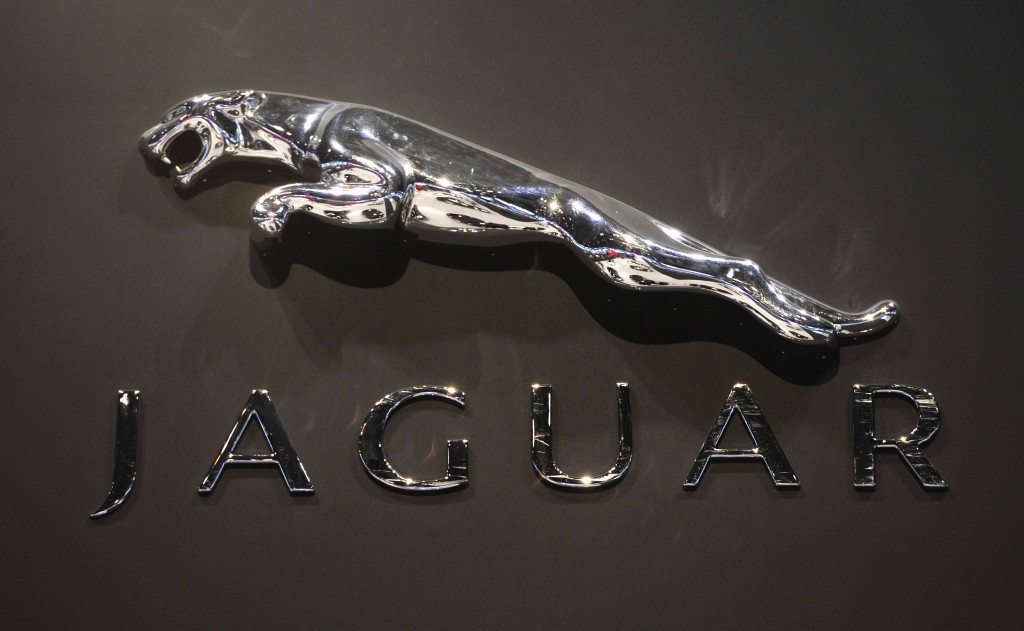
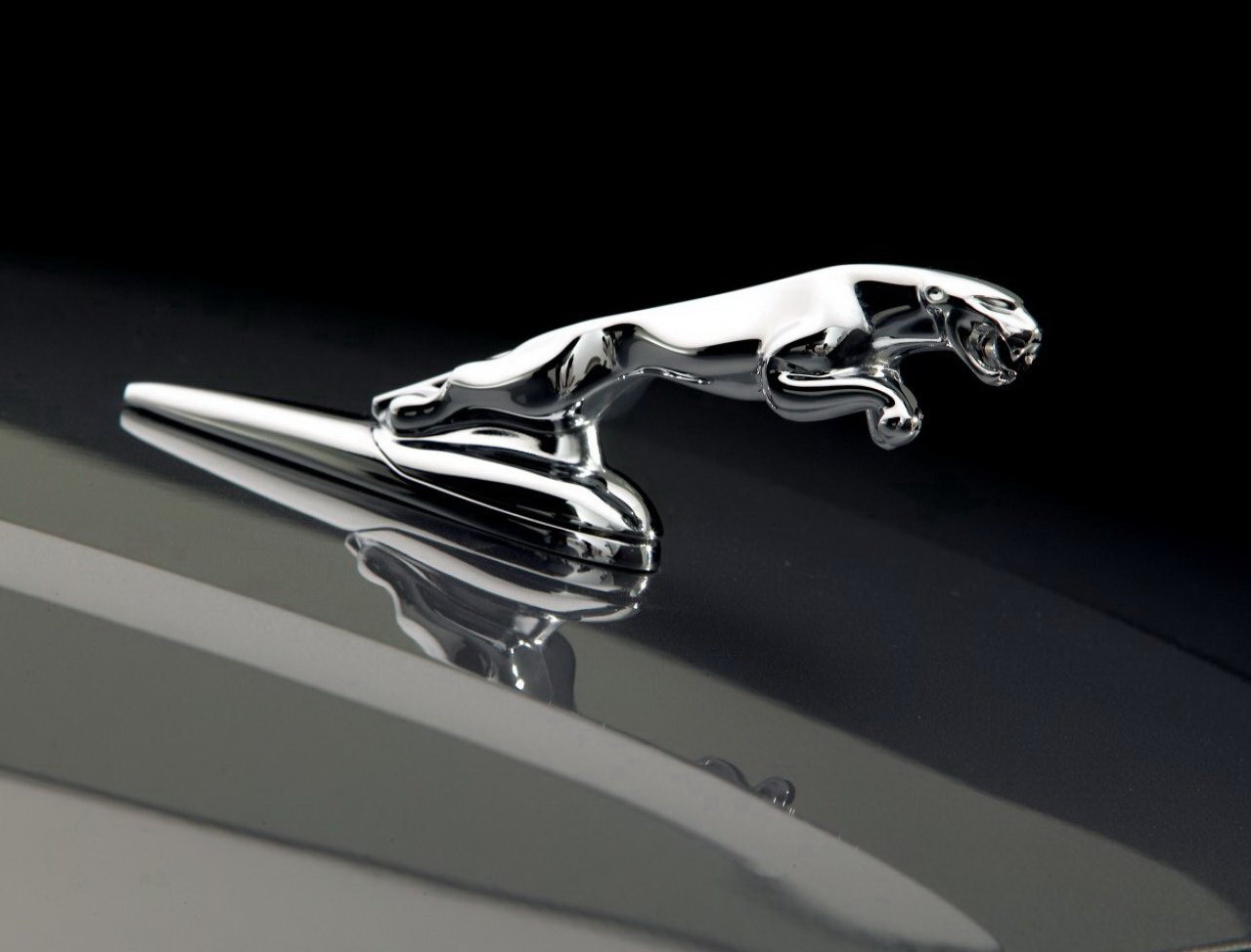
It was meant to symbolize the core values, pursued by the company: grace, elegance, performance, power and ambition to move forward. There was nothing better that a dynamic jaguar posture to reflect all these qualities. The logo has gone through several revisions during its history and the latest update of 2012 made it even more classy and elegant. Tridimensional figure features gradient shades of silver, grey metallic and black to highlight the company’s refined style.
However, the leaping feline is not the only emblem used by the British manufacturer. Older models featured a combination of the jumping jaguar and a more conventional round emblem with a roaring jaguar’s face on silver or red background. This image was embedded into the silver circle. Using potentially hazardous bulging emblems has been lately forbidden with the introduction of new safety regulations and Jaguar was forced to remove the famous jumping jaguar from the hood of all models. It moved to the rear part of the cars, while the second logo with the animal’s face on silver or red font decorates the radiator grills of all Jaguar cars. Yet, the leaping feline still remains one of the most recognizable car emblems in the world.
2021 – now
![]()
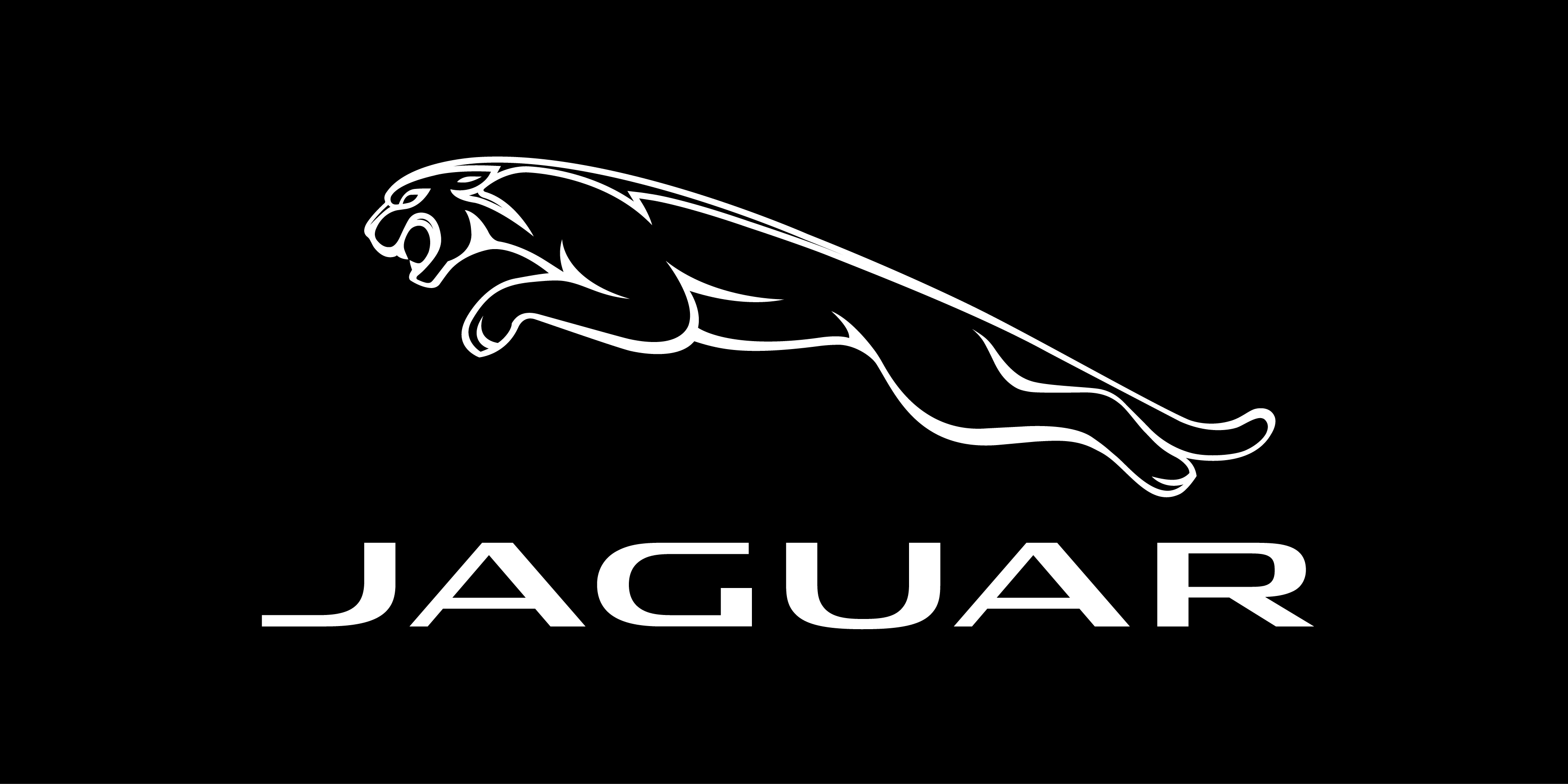
With the redesign of 2021 Jaguar has came back to the flat two-dimensional design. The leaping cat is now contoured in thick black, while the futuristic sans-serif font of the uppercase logotype, placed under the emblem, was adopted from the previous version of the badge.
2023 – now ( JLR Logo )
![]()
The Jaguar logo no longer has an image of a jaguar. This is explained by the fact that now the brand shares a logo with the other brand of the company – Land Rover. The font used to print the “JLR” initials has a very similar feel to the sans-serif font used for the 2021 Jaguar logo. It is very similar to the Dugguen font by Creative Fabrica with the exception of the “R” that has its vertical stroke removed. The brand image turned out very stylish and does a perfect job representing one of the most recognized luxury car brands. Its minimalistic design and black color give it a classic, timeless feel that will not lose its attractiveness even years later.
Description
The classic Jaguar logo that has become a symbol of the British car maker is a jumping feline above the company’s name. It gives the impression of strength, speed and relentlessness. The extensional emblem used to look particularly classy on the hood of the cars when facing the road, however, with the introduction of the latest pedestrian safety regulations such emblems have gone obsolete. Jaguar radiator grills feature another logo though. The roaring head of the animal, embedded into a silver circle, faces forward. It can be seen both on silver and red background.
Shape

The jumping jaguar is a perfect match for powerful and elegant automobiles produced by the company. Its muscular and graceful posture gives a precise idea of power, elegance and sophistication, trademarks of the Jaguar cars.
Color

The latest Jaguar logo, updated in 2012, is designed in silver, metallic grey and black colors. As long as it is a tridimensional figure, gradient colors are used to highlight the shades that make the jaguar posture look rich and animate. The logo can be seen on white or black background. Metallic grey, silver and black are the best colors to symbolize sophistication, elegance and perfection, typical for Jaguar cars. However, the emblem that can be seen on radiator grills and wheels has the red font on several models to stress on performance and passion.
Emblem
![]()
![]()

Official Jaguar website: www.jaguar.com


-
 Taiwan car brands
-
 Romanian car brands
-
 Czech car brands
-
 Spanish car brands
-
 Dutch car brands
-
 Indian Car Brands
-
 Canadian Car Brands
-
 Russian Car Brands
-
 Swedish Car Brands
-
 Italian Car Brands
-
 American Car Brands
-
 Japanese Car Brands
-
 European Car Brands
-
 Chinese Car Brands
-
 Korean Car Brands
-
 Australian Car Brands
-
 British Car Brands
-
 French Car Brands
-
 German Car Brands