Buick Logo
![]() Buick Logo PNG
Buick Logo PNG
Buick is another major American automotive company, a division of General Motors, located in Flint (near Detroit). It is a symbol of American quality. The Buick Motor Division is the oldest auto manufacturer in the United States. They were once America’s most innovative cars. It was these cars that were the first to be produced with completely closed bodies. It was the Buick team who first developed the ultra-fast body painting technology, reducing it from 4 weeks to just 6 hours, and much more. It should be noted that for more than 100 years of its existence, Buick, although it has kept up with the advancements and even often outstripped time, has never bent under fashion trends. Taking into account the wishes of drivers, it, nevertheless, retained its bright personality, maintaining a unique balance of modernity, advanced technology, and good old classics.
Meaning and History
![]()
Buick has a special place in US automotive industry, being the oldest active American car brand and the founding member of General Motors Company. Naturally, the brand’s emblem has changed a number of times since 1903 to conform to car fashion, contemporary design and marketing needs.
1903 – 1905
![]()
The original Buick emblem was introduced in 1903 and stayed with the automaker for a bit less than two years. It was a very detailed and ornate image with the man walking above the globe, pulling a cart. Over the globe the “Known all over the world” Lettering was set in three waving lines, with the elegant capital letters outlined in white. The bottom part of the globe featured the name of the company and its location.
1905 – 1911
![]()
The redesign of 1905 was about making the logo of Buick more up-to-date and professional. It was a circular edge in black and silver, with the fancy and elegant name of the automaker set in the enter, diagonally and underlines, and “The Car of Quality” motto, written in the uppercase around the circular perimeter of the double logo’s frame. The medallion was decorated by small vignettes, coming out to four sides from its elegant silver frame.
1911 – 1913
![]()
The Buick logo was a simple ‘Buick’ wording across the radiator grill in honor of the company’s founder, David Dunback Buick. As time went by, the company was looking for alternative logos and different variations of the ‘Buick’ word were used. A stylized ‘B’ with the letters ‘uick’ embedded into it was used as the company proved successful at the beginning of the century.
1913 – 1930
![]()
Another emblem that did not last long was the ‘Buick’ word on blue and white rectangle.
The logo adopted in 1913 was a rectangle with a blue core and a layer of white near the edges. Across it, they placed the word ‘Buick’, written in a thick, cursive writing. It was arranged diagonally from bottom left to top right, as well as colored white.
1930 – 1937
![]()
The logo, used by Buick from 1930 to 1937 was set in a smooth modern typeface and used a bright red and silver color palette for its script lettering. The stylized numeral “8” was coming out of the lowercase “C” in the diagonally placed wordmark. The “K” in the new logotype was a bit wider than other letters and featured a strong and brutal geometric shape with several straight angles.
1937 – 1939
![]()
It was not until mid 1930’s that Buick cars first came out with the logo based on the ancient Buick family coat of arms. The company’s executives were looking for a more sophisticated emblem that would reflect the brand’s upmarket positioning just below Cadillac, according to GM hierarchy. The idea to refer to the ancient Scottish coat of arms, belonging to the Buick (then Buik) family changed the logo forever. It reflected the prestige of both family and cars produced under the Buick name.
1939 – 1942
![]()
The original shield had a rectangular shape and was designed in terracotta color. White and blue checkered stripe was running from upper left to lower right corner. A golden cross and a golden deer head completed the emblem. This image was the cornerstone of future variations of the Buick logo.
1942 – 1947
![]()
During the following 20 years the color changed from terracotta to red, the rectangular shape was replaced with heraldic and then with a shield-like shape. The golden images of the cross and deer head turned silver.
1947 – 1949
![]()
In 1947 the ornate crest logo gets simplified and the Buick shield becomes the only element of the new insignia. It is now placed directly on the bonnet of the car, or the transparent background, without any framing or roundels. The crest was redrawn in a more modern manner, with wider contours and cleaner lines, and the color palette switched to more coral than scarlet.
1949 – 1959
![]()
The redesign of 1949 has placed the Buick crest into a thick and sleek silver frame, which repeated the contours of the main element. The colors of the badge got darker and brighter, coming back to the classic red and blue palette, used by the company before the last redesign. The upper part of the new silver frame was decorated with a wide element, resembling a grille of a car.
1959 – 1997
![]()
In 1959 a strongly different emblem was introduced. One coat of arms was replaced with three shields placed inside a silver circle to commemorate the launch of three new models.
1975 – 1976
![]()
Mid 1970’s was a difficult time for most car manufacturers and Buick was also looking for new ways to save their market share. A new logo depicting a ‘Happy hawk’ was introduced.
1976 – 1990
![]()
The logo, used by the Buick company in the 1970s — 1980s featured a very bright and intense composition with the flying eagle in gold palette placed above the uppercase logotype, formed by glossy three-dimensional letters, and set on a dark red background, closer to burgundy. This badge was very eye-catching and memorable and stayed with the company for more than a decade.
1990 – 2002
![]()
In 1990 the traditional tri-shield was reincarnated with minor changes. Diagonal stripes became plain, while the cross and deer were discontinued.
2002 – 2015
![]()
Version of the logo introduced in 2002, surprising many with its monochrome silver design. Yet, it combines the company’s heritage and modern elegance.
2015 – 2022
![]()
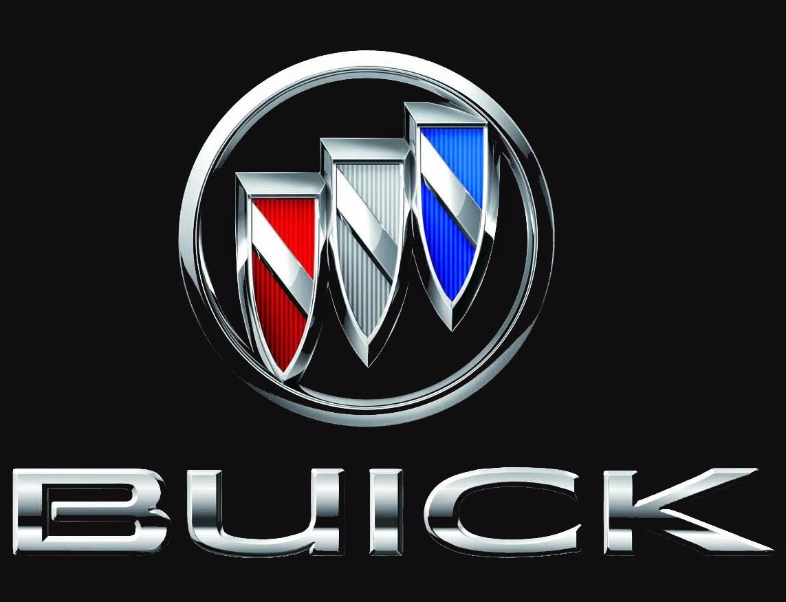
The redesign of 2015 adds colors and letters to the iconic minimalist badge, crested for Buick in 2002. The three crests got now colored in red, silver, and blue, and the stylish and modern “Buick’ wordmark in all capitals of a clean and minimalistic sans-serif typeface, was set on the right from the emblem, in plain black.
2022 – now
![]()
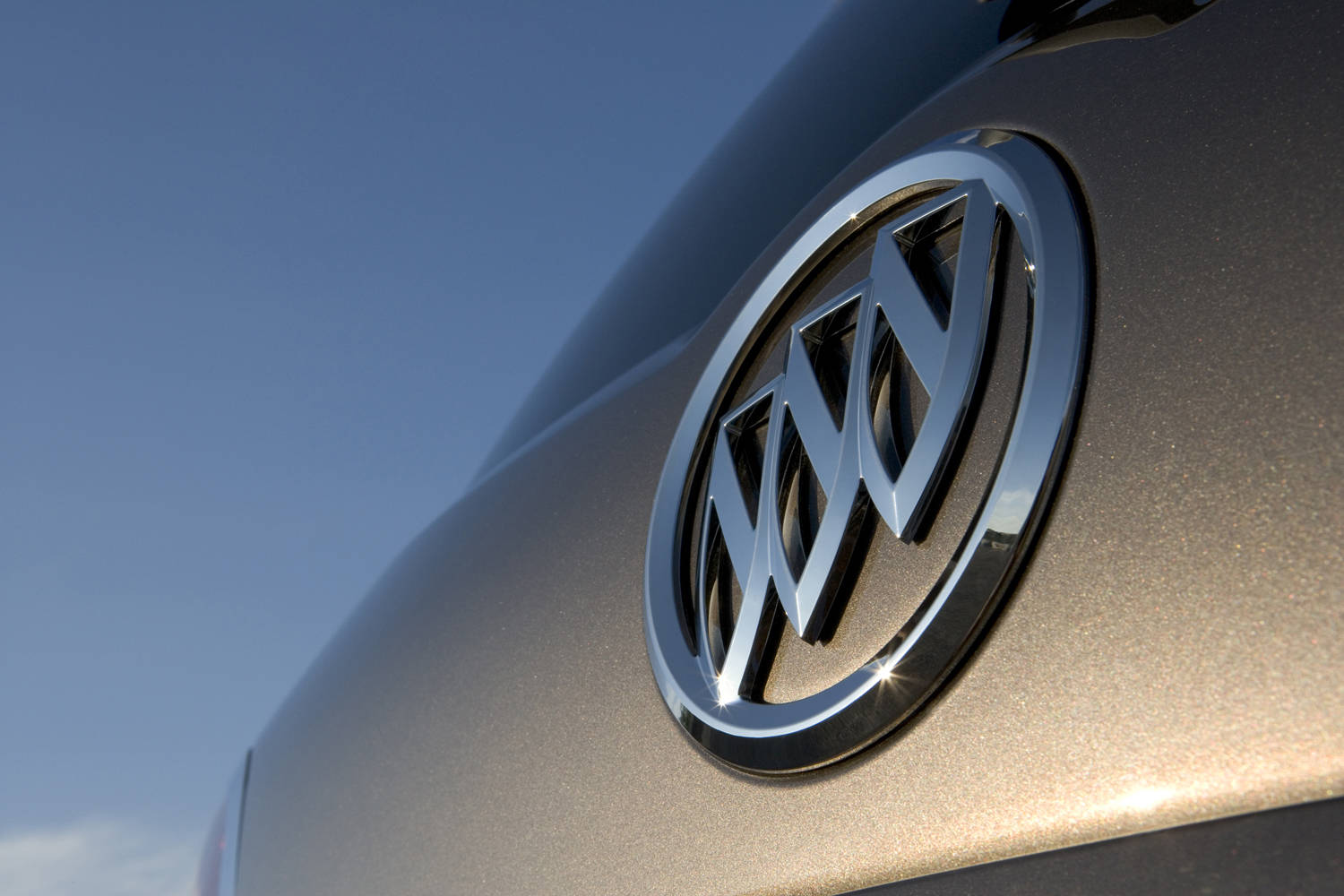
Description
![]()
Buick has tried many emblems throughout the history, but most of them have been based on the coat of arms of the Buick (Buik) family, coming from Scotland. In 1960 the three shields appeared on the logo for the first time to represent the company’s lineup of three models – LeSabre, Invicta and Electra. The current three shields keep the brand’s traditions, but are designed in different shades of silver and feature plain diagonal lines that used to be checkered on earlier versions. The silver circle around the shields completes the modern Buick emblem.
Shape
The central part of the Buick logo is a triple shield, also known as a tri-shield. The elongate shields are placed in a row, rising from left bottom side to upper right side. They are embedded into a circle.
Color
The current Buick logo, introduced in 2002, is all silver, highlighting the elegance of the brand. The emblem features gradient shades of grey to give it a more eye-catching look. However, the original colors of the tri-shield were red, white and blue in honor of the Scottish Buik family coat of arms.
Emblem


![]()

Official Buick website: www.buick.com


-
 Taiwan car brands
-
 Romanian car brands
-
 Czech car brands
-
 Spanish car brands
-
 Dutch car brands
-
 Indian Car Brands
-
 Canadian Car Brands
-
 Russian Car Brands
-
 Swedish Car Brands
-
 Italian Car Brands
-
 American Car Brands
-
 Japanese Car Brands
-
 European Car Brands
-
 Chinese Car Brands
-
 Korean Car Brands
-
 Australian Car Brands
-
 British Car Brands
-
 French Car Brands
-
 German Car Brands