BMW Logo
![]() BMW Logo PNG
BMW Logo PNG
The history of BMW is a series of rapid ups and offensive falls, each of which was followed by a new rise. Now, it is a giant concern with headquarters in Munich, five factories in Germany, and many subsidiaries around the world. The iconic BMW brand is truly exclusive. First of all, it is because the company, unlike other car manufacturers, does not create any sub-brands and adheres to one style from the very beginning. That is why the associations connected with the BMW brand are always clear and understandable. One can hardly ignore the fact that the BMW badge has become one of the most recognizable logos in the world.
Meaning and History
![]()
In 1916, Otto’s company was reorganized as the Bayerische Flugzeug Werke (BFW). Shortly thereafter, another company known as Rapp also underwent a reorganization, and in 1917 the name Bayerische Motoren Werke was born. This event is considered to be the beginning of the history of BMW. The merger of the companies at that time had not yet taken place, but the partnerships were quite close. In 1923, BMW decided to start producing cars. They did not just begin to produce cars, but create a brand of a real elite and expensive car. By that time Camillo Castiglioni, an Italian-Austrian financier and banker, became a shareholder of Knorr-Bremse. He united the two manufacturing companies first under BFW, then the BMW brand. Throughout its history, the brand has earned a great reputation and preserved its original values.
1913 – 1916
![]()
In 1913 when Bayerische Motoren Werke was officially licensed by Franz Josef Popp, the company was a part of Rapp Motoren Werke.
The logo was a black circle with the white space inside. In it, they placed a chess piece of a knight, also black. The ring itself held the name of the company, written in white at the top and bottom (as ‘Rapp Motor’). The sides were occupied by twin white lines each, and there were also stars in their middle.
1916 – 1933
![]()
The 1917 year new trademark was registered under No. 221388 featuring circular design which was actually similar to Rapp logo. However new badge had BMW letters on it body located on the very top of the ring.
At the same time new symbol was colored blue and white which were official colors of Bavarian Free State. However it turned out that it was impossible to use national colors for trademarks in accordance with existing laws which prohibited using such tones for any commercial purposes during that period of time. That is why for some time it was not used as the main logo of the company. This fact explains why the majority of people mistakenly think that BMW badge is connected with spinning propellers.
1923 – 1953
![]()
Originally letters and the outline of BMW symbol were made in gold color. It was placed on the body of the first R 32 motorcycle model produced by the brand. It was presented to the public in 1923.
However several changes have been made since that period of time. Though letters were still made in gold color, they were located bit closer to each other and the font became bolder. New version of this german car brand logo officially appeared in the German Register of Trademarks in 1933.
In 1929 new logo appeared on the cover of BMW aircraft magazine. It showed images of several aircrafts featuring Roundel inside the rotating propellers. It was made as a part of new advertising campaign right before the Great Depression broke out. But still the badge has nothing in common with propellers. However nothing could stop from spreading this idea and eventually in 1942 Wilhelm Farrenkopf gave even greater credence in BMW journal featuring practically the same image of aircraft with rotating propeller and Roundel.
In spite of all superstitions and speculations BMW Roundel was officially born and registered by Franz Josef Popp on October 1st, 1917. He was appointed as General Manger of new enterprise and received a confirmation certificate on obtaining new logo. There were actually no any changes within almost 90 years with the exception of slight amendments. But the base of BMW symbol is the same.
1936 – 1963
![]()
In 1936, they mostly just changed the color scheme, as well as text details. The bronze lines all over the image were replaced with thinner, silver ones. Two lines were also added between the parts of the checkered pattern in the middle. Furthermore, the bright blue in it was replaced with turquoise. The text font was altered slightly: mainly, the serifs became much blockier.
1963 – 1997
![]()
In 1963, the silver lines were replaced with white ones. The borders they have inside the pattern were gone, but they added a layer of black around the outermost edges of the emblem. The turquoise was swapped for a brighter, yet still pale, blue shade. The letters at the top are now just basic sans-serif characters, colored white.
1970 – 1989
![]()
This secondary logo uses the previous design as its basis. Here, it was reduced in size and placed inside another circular pattern. Basically, there were three colored layers around it, each divided into two bits. The first one was pink and white, the second one – white and dark blue, and the last – turquoise and white. The positioning of these bits against one another varied.
1997 – 2020
![]()
In 1997 BMW logo came up with 3D printed forms. It made it possible for designers to create more dynamic and bolder look for the badge. After such changes logo managed to enter the top 10 rank of the most recognizable auto badges all over the world. BMW logo reflects symbolism and simplicity as well as original design which has successfully passed the test of time.
2020 – today
![]()
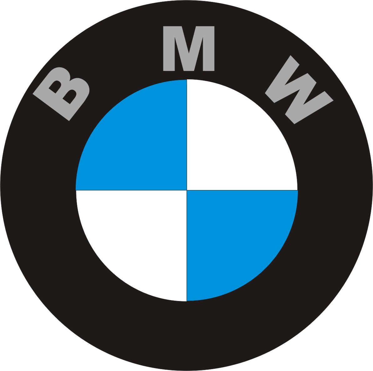
The 2020 redesign simplified the logo. It’s a 2D image with a thick grey border on the outside, a white space immediately inside and a slimmer grey border that encircled the white bits of the pattern in the middle. The blue ones didn’t have a border. The letters were the same style, but were now colored grey.
Description
![]()
BMW logo consists of 4 blue and white quadrants which are enclosed within a circle. White and blue colors used for every quadrant symbolize Bavarian Free State. Letter BMW are located at the top of the circle.
They stand for Bayerische Motoren Werke which was registered in 191. Nothing has changed from that time. Though logo reminds of the fact that company dealt with producing military planes during WWI, it has nothing in common with aircraft production.
Shape
We can say for sure that BMW originated from Rapp logo. They are not equal but still there is certainly something in common between them. Rapp badge was also made in shape of a circle with a black horse inside of it. Letters “RAPP” were located on the top of the circle. Actually the same thing we can see in BMW badge. Round basic encloses three letters which stand for the official name of the company. In other words major part of the symbol was arranged practically in the same way. This is probably the main reason why Roundel was chosen as the main symbol though it was developed a bit since that time becoming one of the most popular and recognizable circle in the world’s automotive industry.
Color
Eventually it was decided to change the proportions. This is when blue color and shades were used. At the same time several badge versions were introduced featuring gold, white and silver letters of different sizes. However, all those variants turned out to be absolutely useless when it came to marketing campaigns. That is why only two main versions were used by 1950’s. They included standard white and silver lettering.
The first variant could be found on autos produced by the brand while silver lettering was mostly used for motorcycle bodies. Later serif font was used for all motorcycles without any exception.


-
 Taiwan car brands
-
 Romanian car brands
-
 Czech car brands
-
 Spanish car brands
-
 Dutch car brands
-
 Indian Car Brands
-
 Canadian Car Brands
-
 Russian Car Brands
-
 Swedish Car Brands
-
 Italian Car Brands
-
 American Car Brands
-
 Japanese Car Brands
-
 European Car Brands
-
 Chinese Car Brands
-
 Korean Car Brands
-
 Australian Car Brands
-
 British Car Brands
-
 French Car Brands
-
 German Car Brands