Alfa Romeo Logo
![]() Alfa Romeo Logo PNG
Alfa Romeo Logo PNG
For most, Alfa Romeo has always been more than just a carmaker. Its extraordinary cars evoke the memory of the “Golden Age” of car racing. Alphas breathe delight and passion. Cars of this brand awaken passion, appealing not to the mind, but to the heart, preserving the spirit of the endless road and perfectly combining adventure with speed and beauty. True to their heritage, their stylish sports cars still carry racing ancestry. The Italian brand Alfa Romeo is undoubtedly one of the most famous in the automotive world. However, it is also one of the most problematic: there are perhaps fewer successful years in the history of Alfa Romeo than relaunches of the brand.
Meaning and History
![]()
There have always been lots of myths and legends around the origin of Alfa Romeo official logo. Though popular Italian automaker was founded in 1910, its badge was changed and evolved numerous times throughout its long history. That is why it is rather hard to speak about the origin of the badge taking into account lots of different versions. We will try to stick to the facts.
It is commonly known that the logo was created on the base of Visconti family coat of arms. At the same time it has a background in form of the Red Cross which is a symbol of Milan. At the same time it is said that cross was used in order to commemorate Giovanni Da Rio who was the first one to erect the cross while climbing the Jerusalem wall during crusade. That is why some people say that the badge is mainly a shield which is reversed over the Castello Sforzesco located in Milan.
This is probably the hardest part of the puzzle provided by Alfa Romeo badge. From this point everything is a bit easier and clearer for understanding. A.L.F.A stands for Anomina Lombarda Fabrica Automobili.
1870 – 1910
![]()
The initial Alfa Romeo logo was a sprawling image, framed in a rectangular shape with a domed top. They placed several elements there. The center was occupied in the top by a black circle with the word ‘Alfa’ jammed inside it. On its either side, there were some black linear and flower imagery. Beneath, they placed the firm’s full name: ‘Anonima Lombarda Fabbrica Automobili’ (in one line) and ‘Milano’ (below).
1910 – 1915
![]()
The old version of the badge appeared in 1910. It had Alfa letters written on the top of the logo. Two figures of eight knots were placed in the middle of the badge and Milano underneath the composition.
However it was changed 5 years later depicting Alfa Romeo writing over Mila no red cross which was located at the bottom. After Alfa models won numerous racing titles and competitions it was decided to mark this fact on the logo of the company which featured gold trim for encompassing the badge.
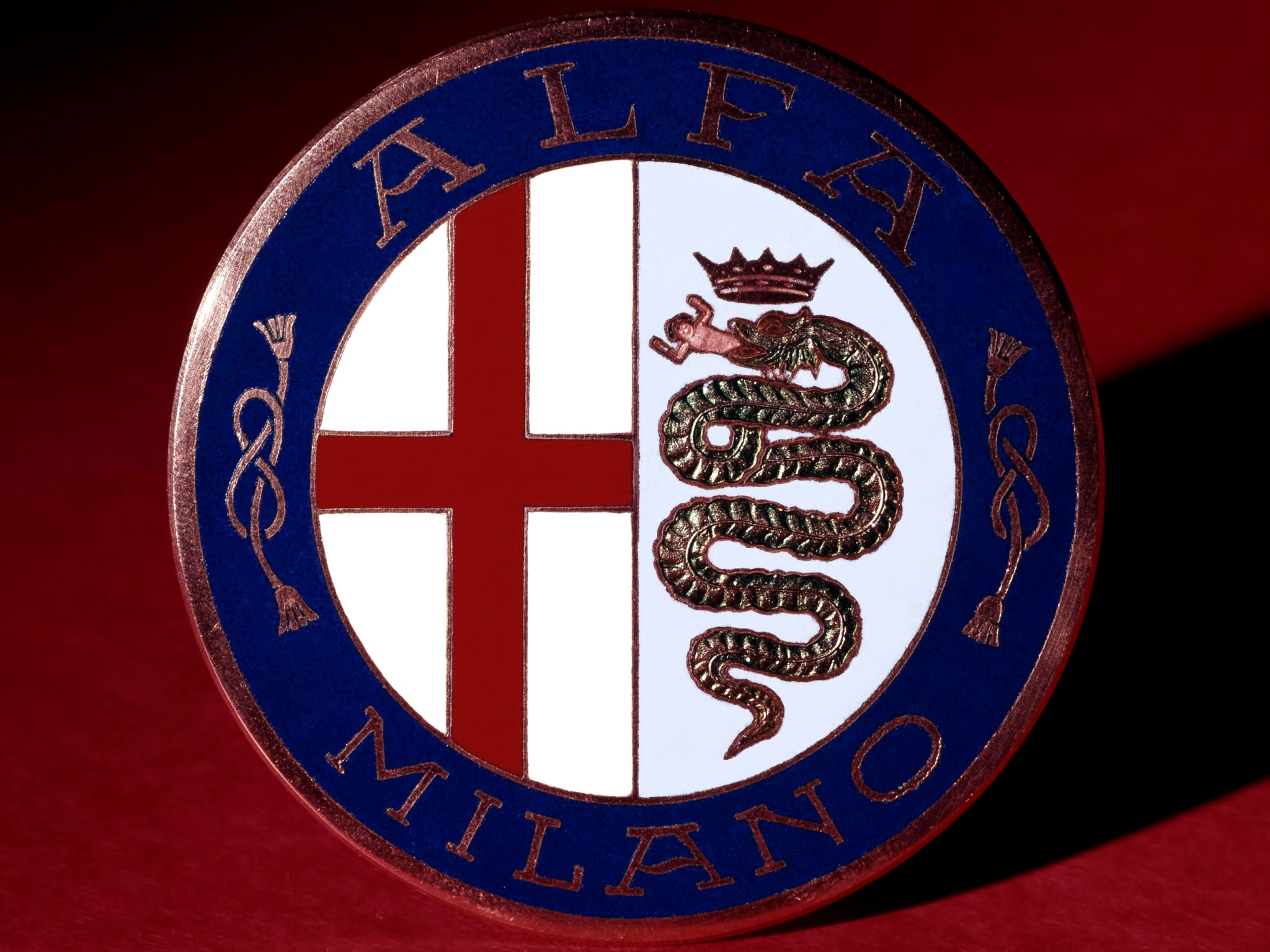
In 1910, they released the first of the series of iconic AR badges that they keep using even now. It’s a round badge with a thick blue frame and a center, divided into two sections. The left section is just a white cloth with a red cross on it, the flag of Milan. On the right, the big coiling snake is depicted against a turquoise background. Above its head, they placed a crown, and in its mouth there was a man. These are also symbols of Milan. The blue frame around holds the name ‘Alfa Milano’.
1915 – 1925
![]()
In 1915, the logo was simplified. From a metal-styled badge, it turned into a bright circle. Most elements stayed as they were, even if in a simplified form. Moreover, the top and bottom edges now said ‘Alfa-Romeo’ and ‘Milano’ in bold white letters with yellow fringes.
1925 – 1933
![]()
In 1925, they made the badge a bit more realistic. It again resembled a badge, but with a lot less metal. Most elements were slightly changed, but the layout remained the same. The coloring changed slightly, mainly by switching blue for black. The biggest change was the addition of a frame of laurel wreaths around the whole logo.
In 1927 it was changed again and trim disappeared from major Italian automaker and later returned.
1933 – 1946
![]()
Besides small changes in the coloring and small details, designers largely left the emblem alone. The color scheme became darker, while the wreath frame became more prominently metal.
1946 – 1947
![]()
They simplified some details again, rearranged the imagery and made the fringes much slimmer. Prominently, the laurel wreath around the logo became a much slimmer silver frame.
1947 – 1948
![]()
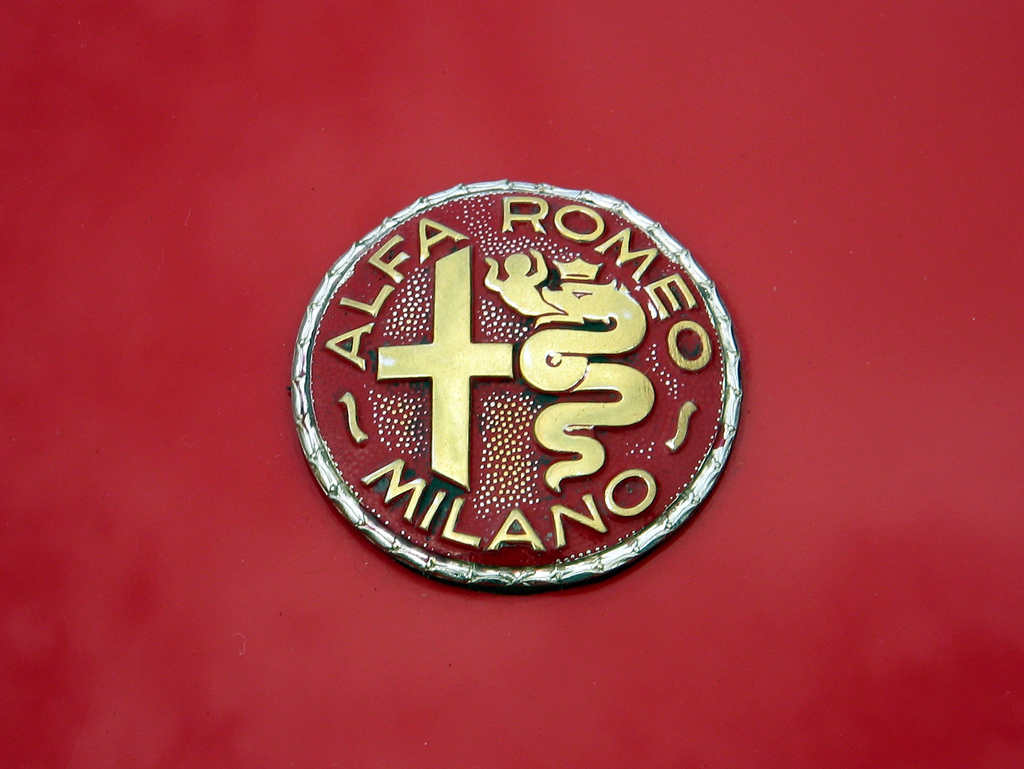
The 1947 version uses only three colors: red, gold and metal grey. Most of the circle is bright red, while cross, snake, man and crown are grey. The letters, as well as the knots, are golden. In this variation, they didn’t separate the frame from the center, and the central sections between them. The layout didn’t change much, but some elements were altered somewhat.
1948 – 1950
![]()
In 1948, they made it again into an image rather than a badge. They returned the usual layout of the pre-1947 designs, but altered the colors. There was now little yellow, and the sections were separated using black lines. The scheme itself became strikingly bright. The wreath frame became a thin, almost ineligible layer of bright yellow.
1950 – 1971
![]()
In many details, the logo really became identical to the earlier designs. It was once more a relief badge with a metallic touch. The imagery also became more detailed and nuanced, but nothing starkly different was added.
1971 – 1972
![]()
This design didn’t live long independently, but it introduced some elements that most following designs kept using. The snake became a series of largely horizontal layers with increasing width the closer to the head you get. The head, man and the crown at the top were diminished in nuance and became a collection of lines and dots, largely. Golden lines separated the sections once more. Above, the words ‘Alfa Romeo’ were fused almost into one, while ‘Minalo’ and knots vanished.
1972 – 2000
![]()
This design has essentially the same layout. It’s more of a picture than a badge, like the one before it. The got rid of the wreath frame altogether, replacing it with a thick yellow fringe. The same thick yellow is used for outlines throughout the logo. The other colors are also simpler and brighter. The name at the top of the blue frame was again split up, while the letters took on a bright yellow appearance.
2000 – 2015
![]()
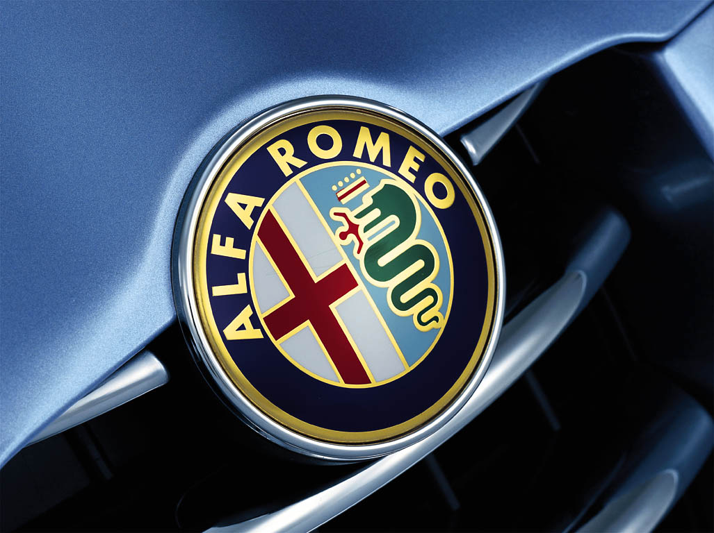
In 2000, they added a lightning effect, coming from the top left of the logo. The color scheme was slightly altered, but in just small touches. For instance, the bottom of the white cloth was given a visible turquoise tint. Moreover, the colors throughout the emblem turned either paler or darker, no more simple shades.
2015 – now
![]()
Apart from all changes it still keeps heraldic spirit and looks rather ancient and classy. This is probably why it is in top of the most recognizable badges of all times. In addition it has always attracted auto fans and gourmets with its mysterious and myths related to the origin of the badge. During its history and development it also received several new elements including a giant snake which eats a man. Let’s try to figure out what it means and reveal all secrets of Alfa Romeo logo.
Description
![]()
As we had already mentioned Alfa logo has a very strong historical background featuring heraldic ancient elements. The Red Cross as one of the main elements is supposed to be associated with Milan. This symbol was often used after Crusades. On the other hand Red Cross is widely spread among other Christian symbols.
A biscione is one of the most controversial elements in Alfa badge. At the same time logo depicts a man which can be described as a child which is also known as Saracen or Moor. In other words the whole scene describes crusaders’ defeat which sounds a bit strange.
Representatives of the company are not eager to recall those times and give the exact definition of their logo telling it is nothing more but an ancient city.
Shape
Alfa Romeo badge is made in round shape which encloses heraldic red cross, huge snake eating a man and golden Alfa Romeo letters which are located on the top of the circle. Milano writing is underneath. Nothing is known for sure about the fact why the founder chose such shape for his company’s logo. Nevertheless it is still one of the most recognizable badges not only in Italy but also in the rest of the world.
Color
Several colors are used in Alfa logo including white and blue background. Some colors reflect ancient sacred meanings which were used in Christian religion during crusades. The Red Cross is a good example of such symbol which is also associated with Milan and crusaders. Green snake eating a man that can be interpretation of a modern child which symbolizes the defeat of crusades which looks rather strange on the background of Italian history and symbolism.
Several logo versions were made with gold trim in order to commemorate numerous racing titles and wins throughout brand’s successful racing history. However the idea was not very popular and in two years after gold letters were introduced they were removed from the badge.


-
 Taiwan car brands
-
 Romanian car brands
-
 Czech car brands
-
 Spanish car brands
-
 Dutch car brands
-
 Indian Car Brands
-
 Canadian Car Brands
-
 Russian Car Brands
-
 Swedish Car Brands
-
 Italian Car Brands
-
 American Car Brands
-
 Japanese Car Brands
-
 European Car Brands
-
 Chinese Car Brands
-
 Korean Car Brands
-
 Australian Car Brands
-
 British Car Brands
-
 French Car Brands
-
 German Car Brands